
Breaking the mould
How building visual distinction sparked new meaning for giffgaff
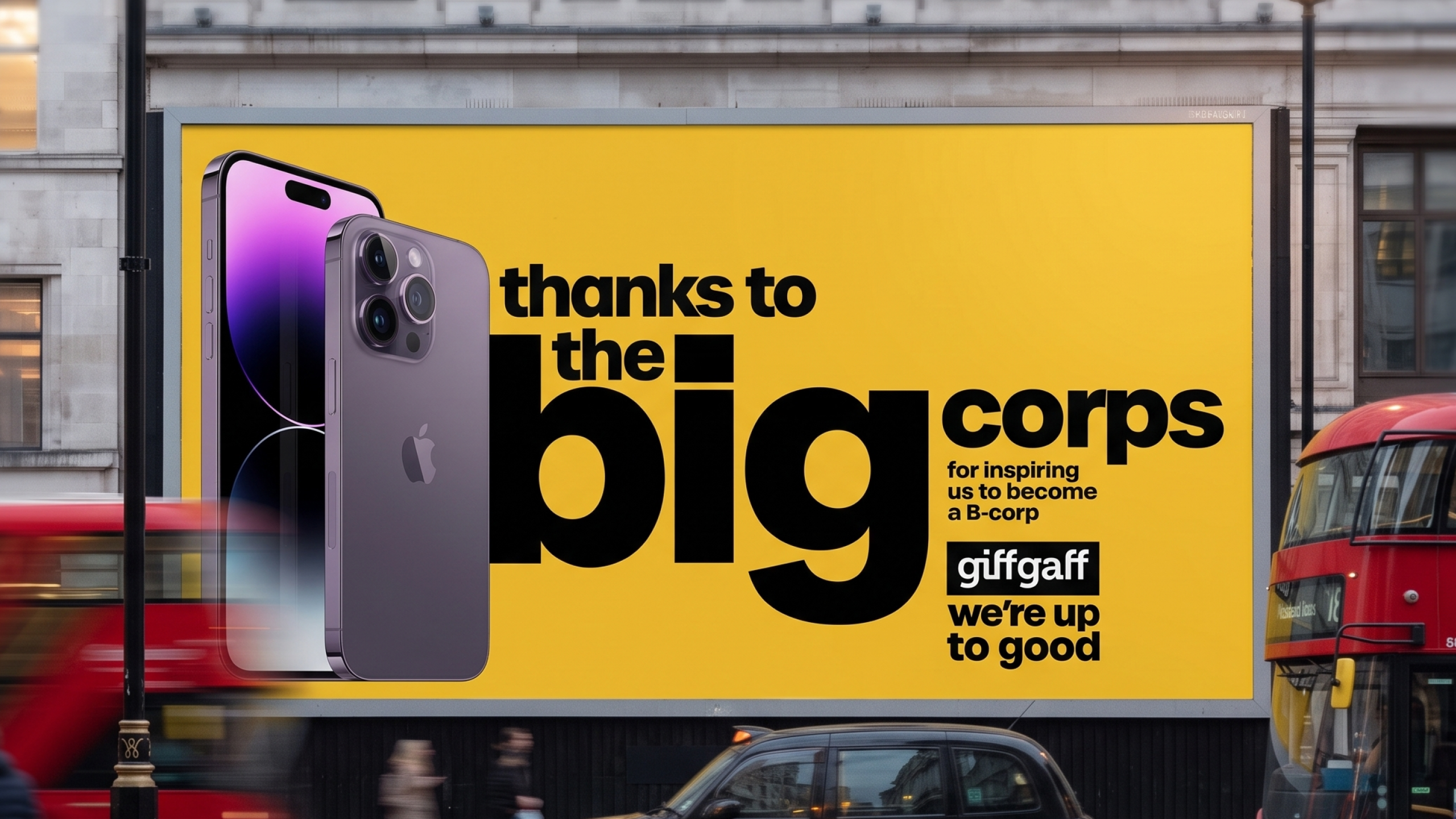
The diagnostic
When giffgaff set it’s ‘Up to Good’ brief, the business faced a dual challenge: a heavily commoditised telecom MVNO market locked in price-reduction wars, and an internal production bottleneck.
The market problem
Category convention relied on short-term, rational, price-led messaging. Our analysis was that to build long-term mental availability and emotional connection, we had to pivot from ‘price’ to ‘values’.
The operational bottleneck
The internal creative studio needed to execute a cross-channel identity shift but was slowed by complex, bespoke asset creation.
The core insight
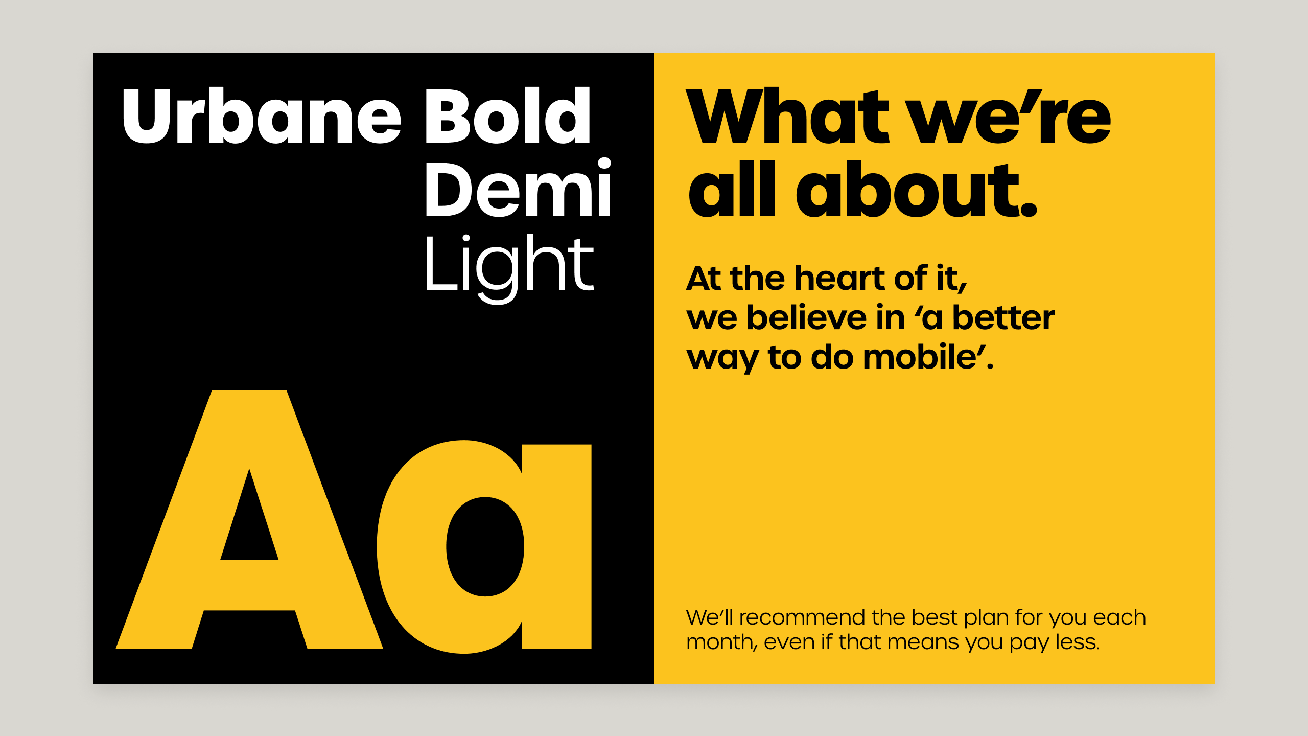
Creative distinctiveness yields better long-term ROI. Delivering that efficiently meant designing not just a new campaign identity, but an elegant, scalable visual system balancing typographic confidence with extreme visual restraint.
The design solution
Partnering with the creative agency Neverland and giffgaff's internal design studio, I art directed the complete visual system. The goal: clarity over complexity, so every asset could scale from a 48-sheet billboard down to a 300×250px web banner without losing integrity.
From category convention to a scalable system
| Category Blandscape | My Design Philosophy | The New Scalable System |
|---|---|---|
| Safe, transactional copy | Typographic confidence | Oversized hero typography |
| Maximalist, complex collage | Extreme visual restraint | Clean, cutout photography |
| Slow production workflows | Rule-based modular grids | 4-color agile architecture |
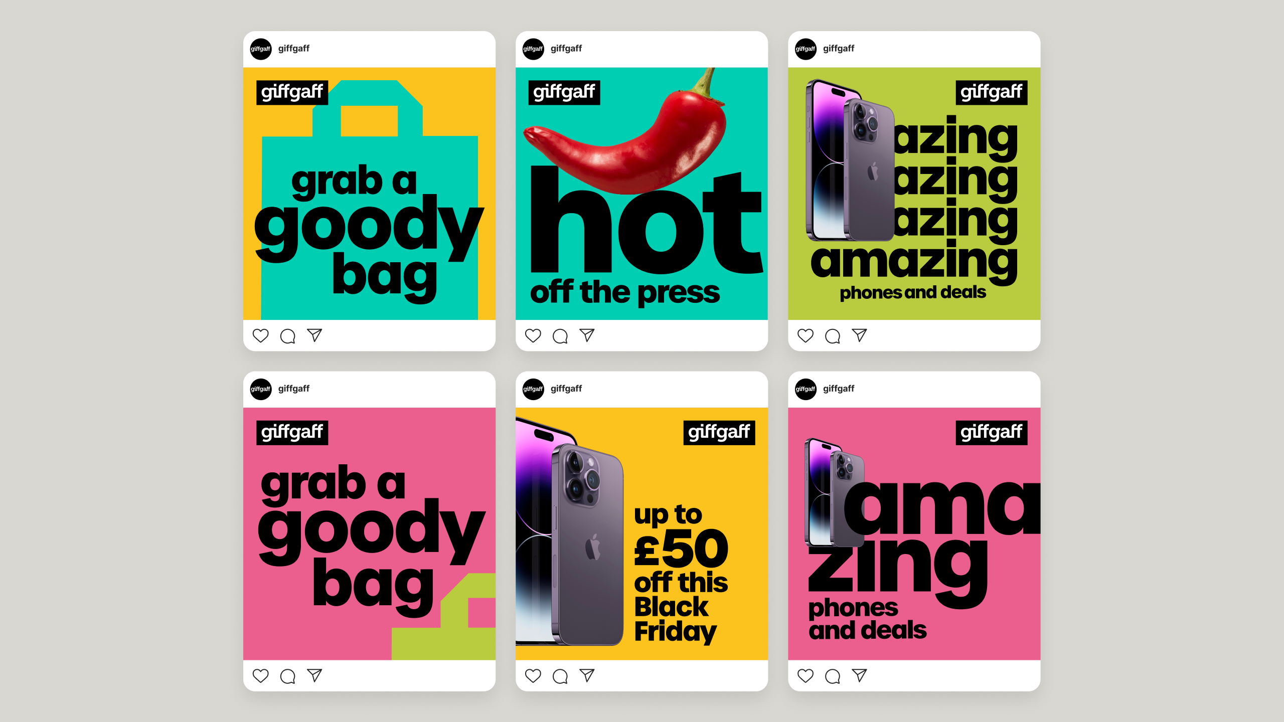
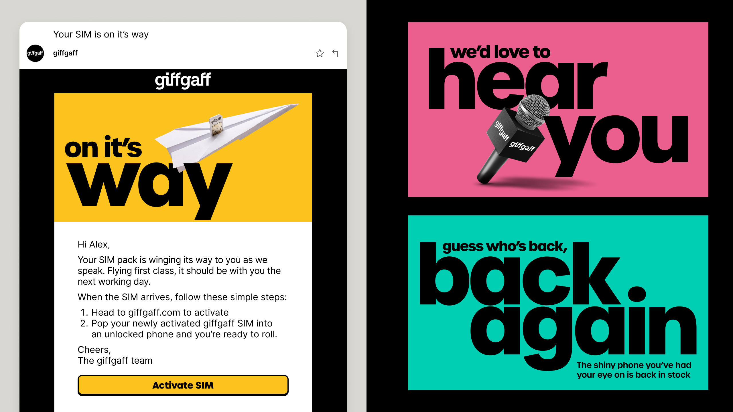
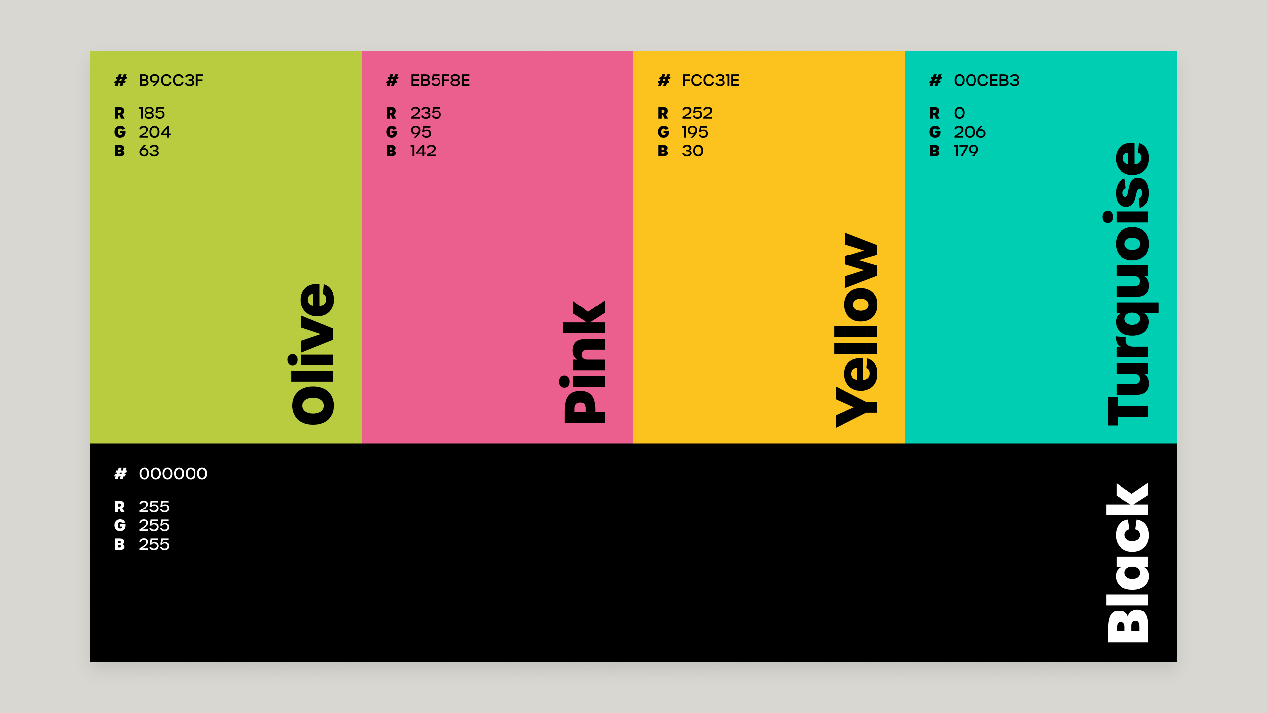
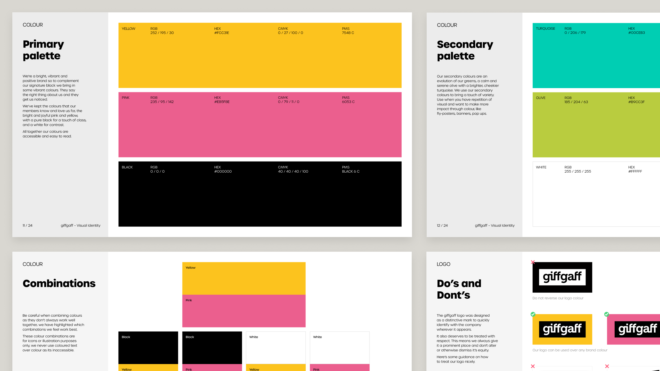
I engineered a four-colour hierarchy – pink, yellow, turquoise, olive – and a structured layout ruleset. That ruleset became the studio's design-operations blueprint, letting the team assemble hundreds of digital and print assets in parallel without creative drift.
The performance & business impact
System1 memorability score well above the category baseline. Significant uplift in brand sentiment among existing members.
Full results
| Metric | Category Norm | "Up to Good" Performance | Business Impact |
|---|---|---|---|
| System1 Memorability | Standard Baseline | Score of 11 (Well above norm) | High breakthrough engagement in a cluttered market. |
| Customer Retention | Baseline Churn Pressures | 11,000 Port-Outs Prevented (H1 2023) | Record-low churn during peak market turbulence. |
| Brand Sentiment | Baseline Trust Levels | Significant Uplift | Stronger emotional affinity among existing members. |
My reflection
The real validation came when internal teams recognised the strength of the identity and chose to scale it across every permanent brand touchpoint—effectively using this system to restructure giffgaff's entire visual identity.
This project marked a shift in my own position: from a freelance creative delivering standalone campaigns and assets, to a strategic design leader engineering the systems that fuel business growth.
The tight initial campaign window limited how far the new assets could go on day one, but giffgaff leaned into a transparent, analytical learning culture, and we proved to stakeholders that long-term visual equity requires asset continuity. This wasn't just a successful campaign. It was the operational blueprint for giffgaff's future creative output.
Art Direction
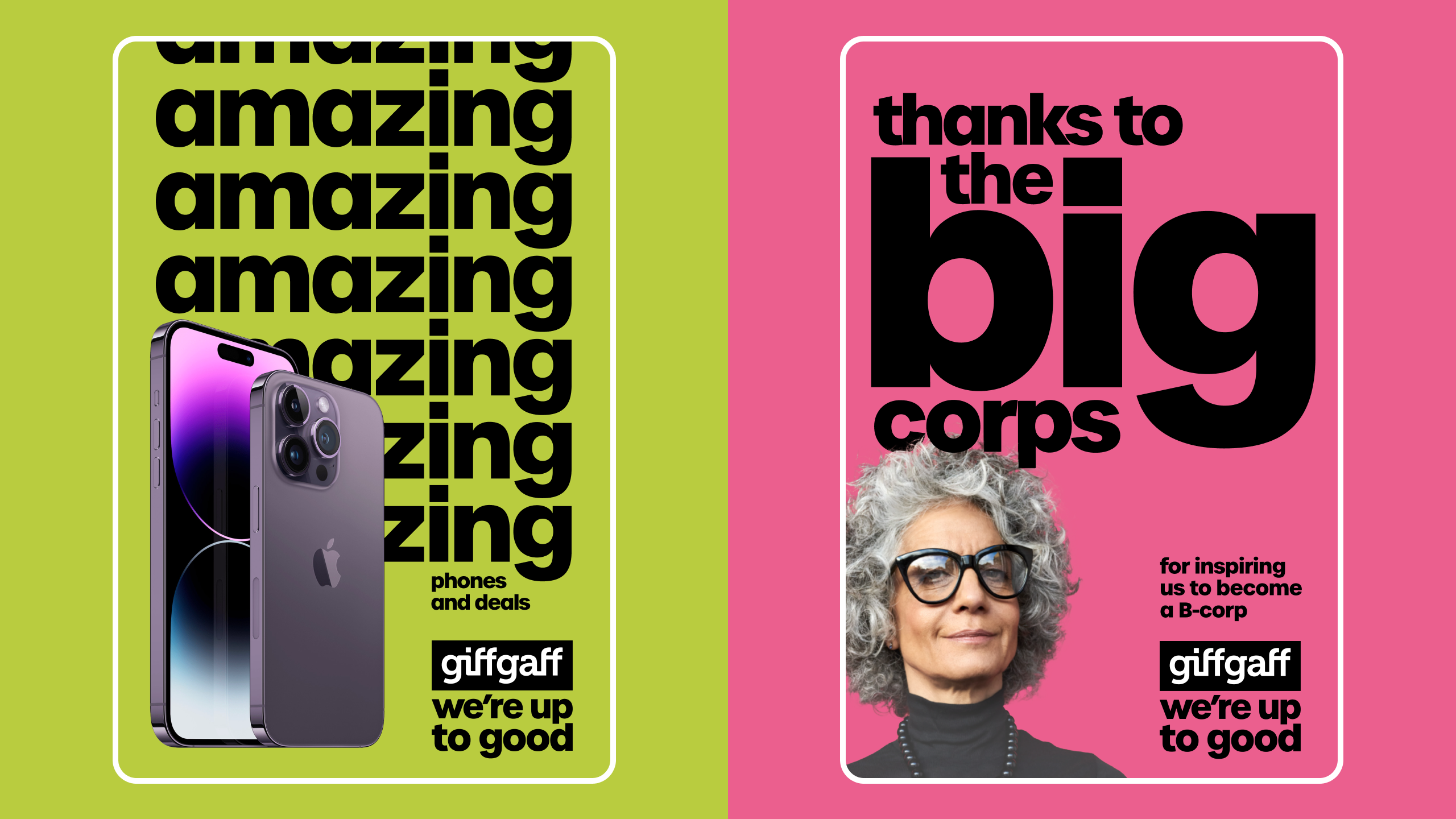
Oversized type on a OOH 6-sheets stood out against category convention
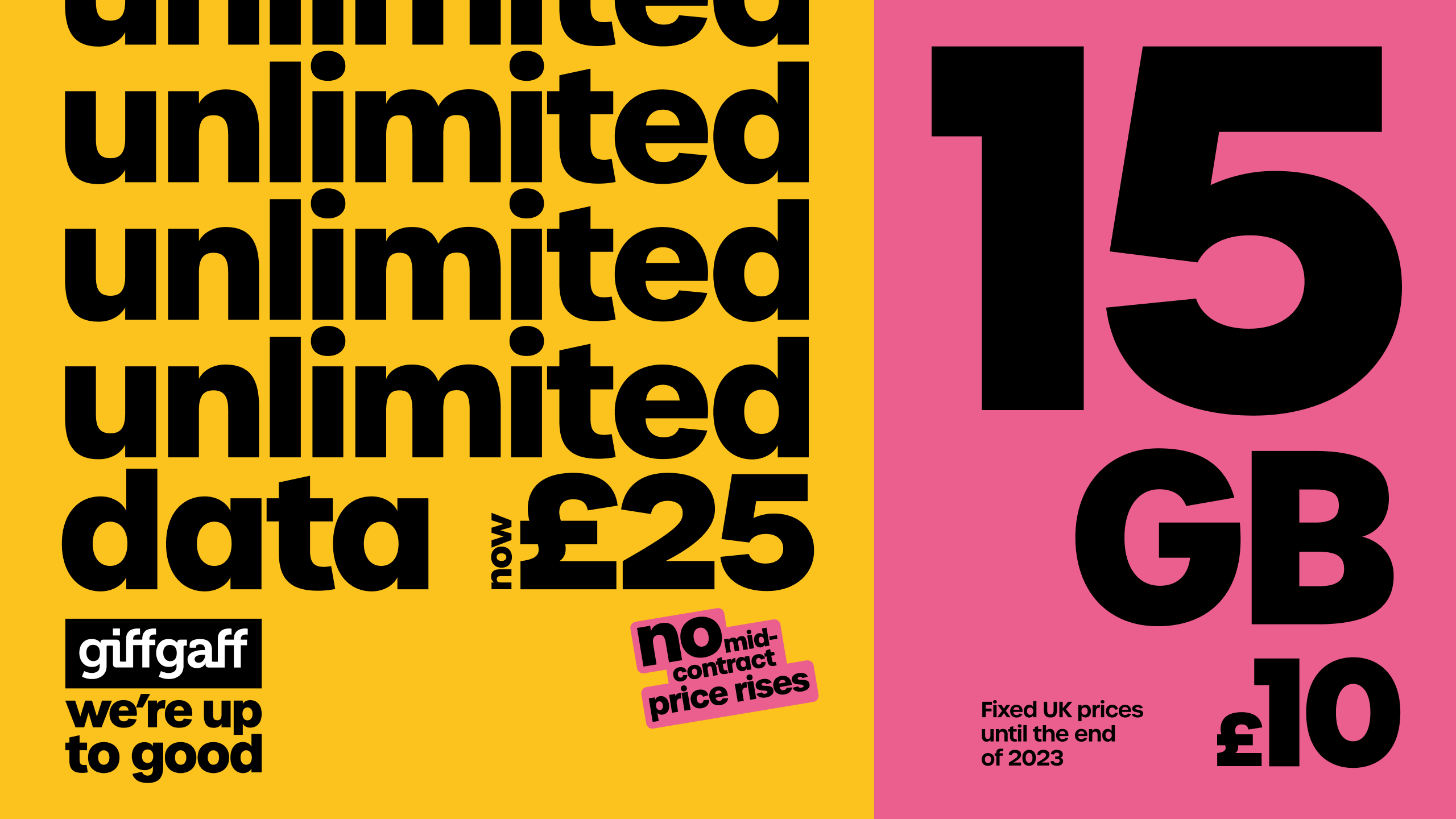
Type as structure creates unique and interesting layouts that are never repeated
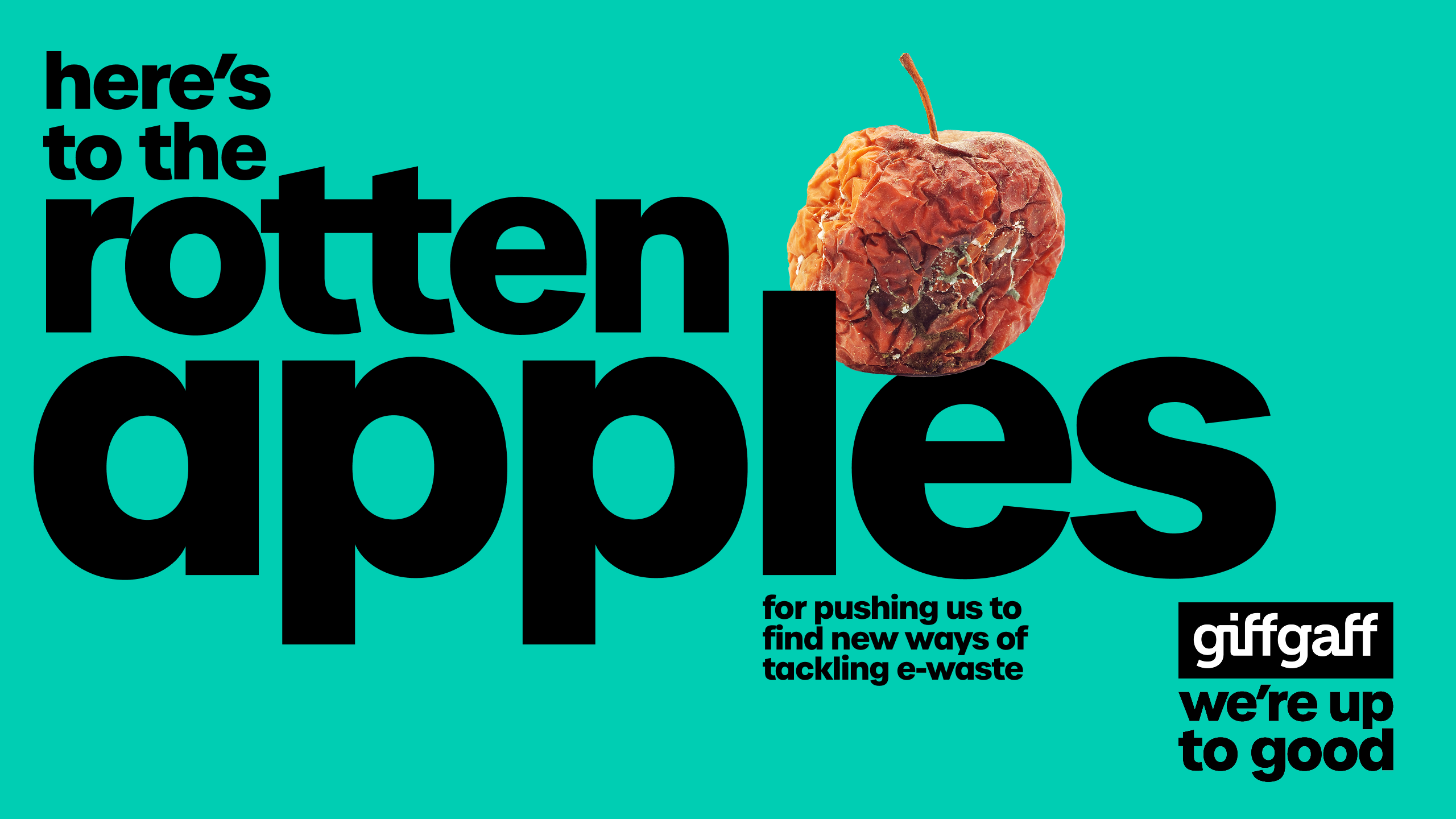
Type-ted art direction that uses curated imagery to provoke curiosity
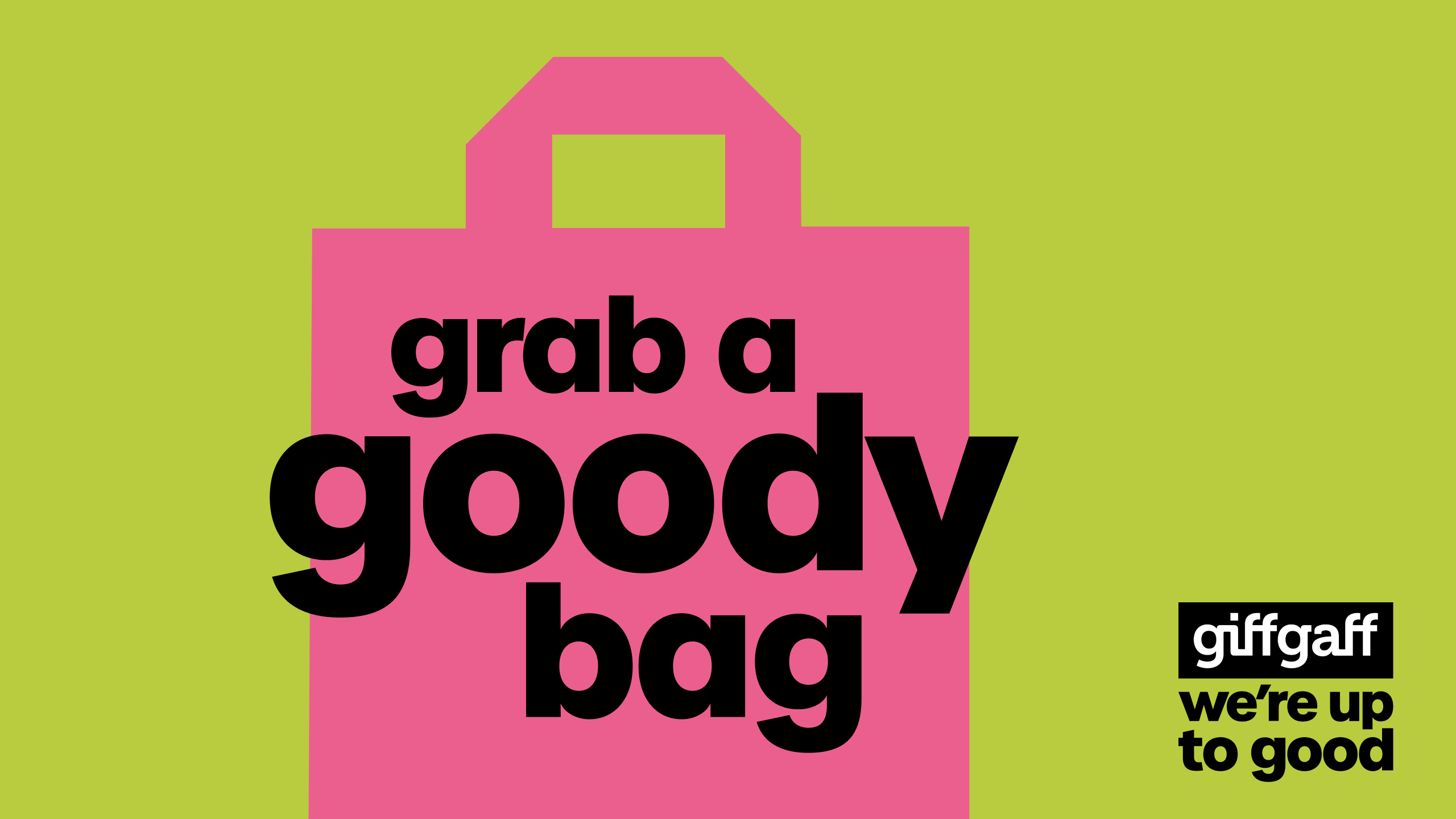
Bold simplification of the goodybag that earns its place within the new campaign identity
Website application
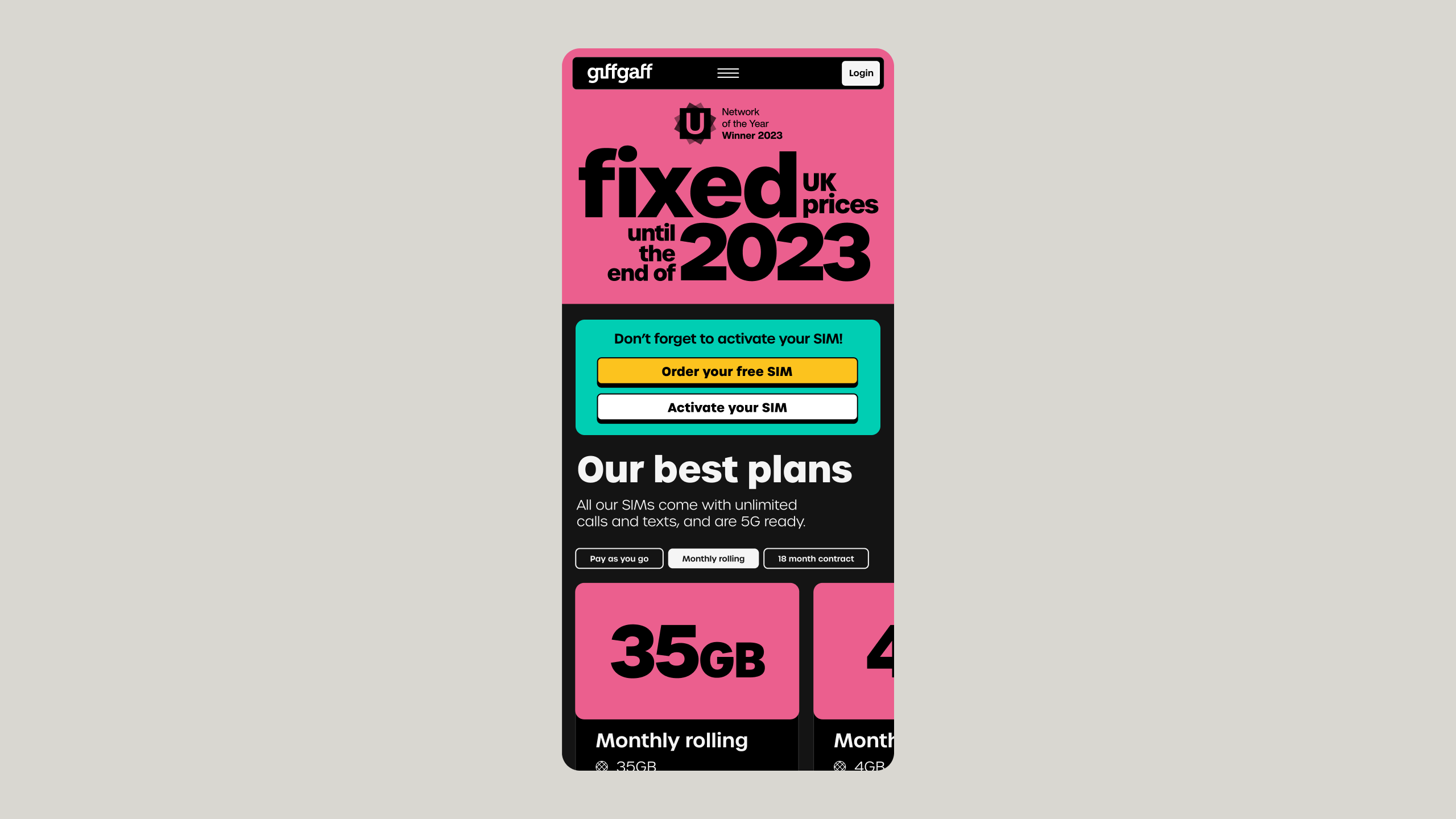
Colour and typographic art direction applied to existing mobile web view
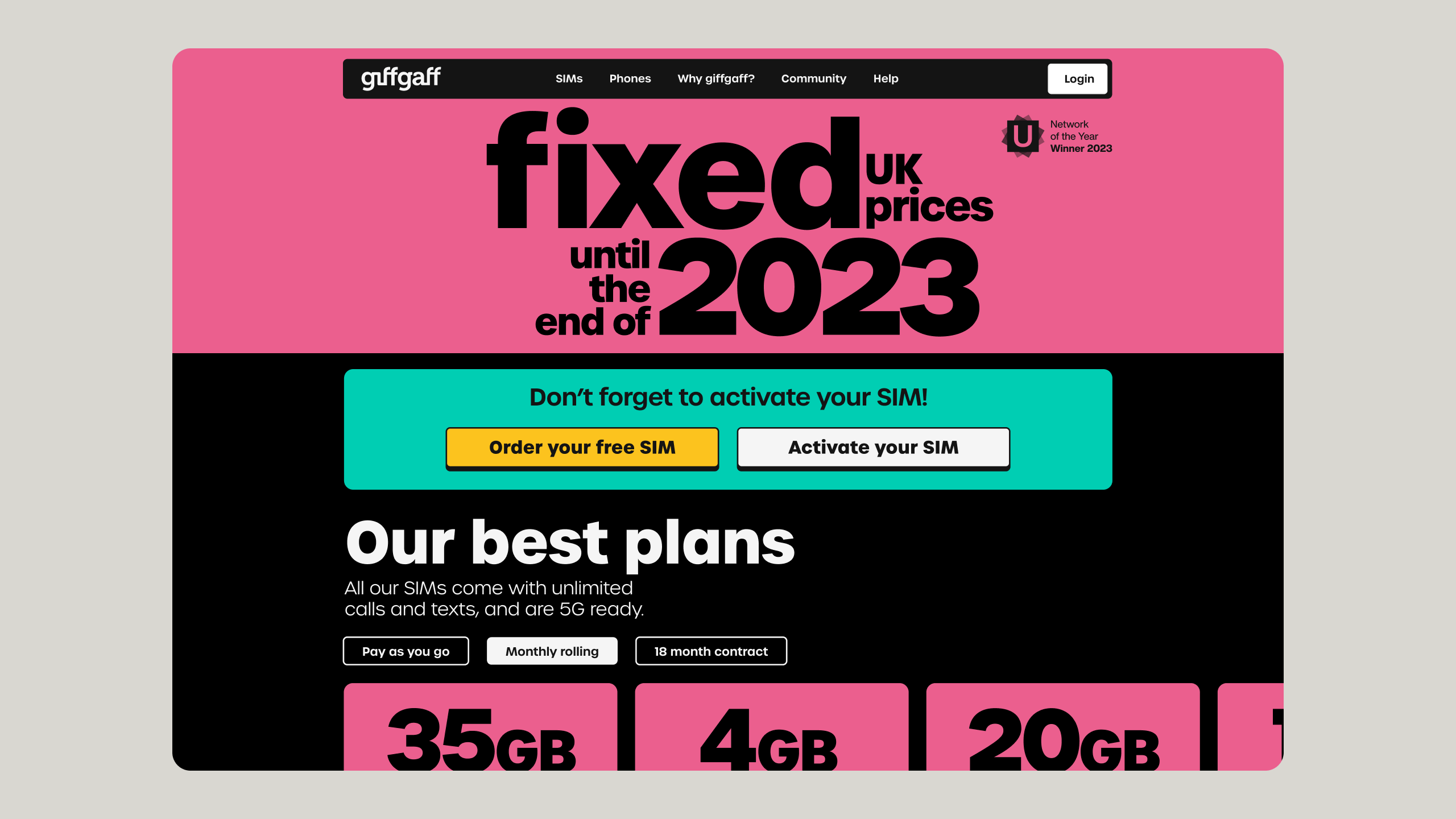
Colour and typographic art direction applied to existing desktop web view
Social & comms application
Performance media DR advertising using creative variants to keep ads appearing fresh in-feed
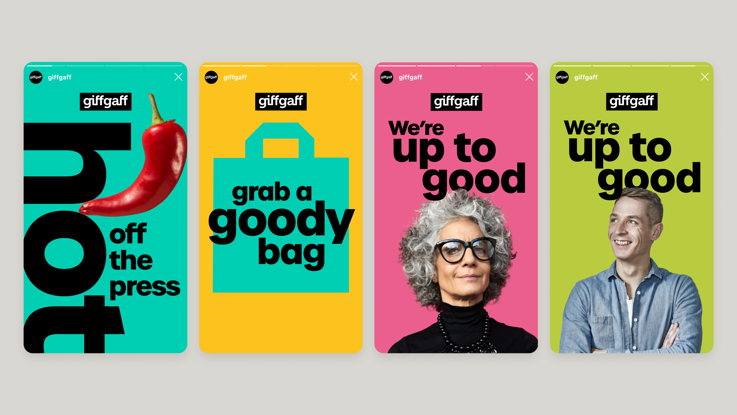
Brand design system
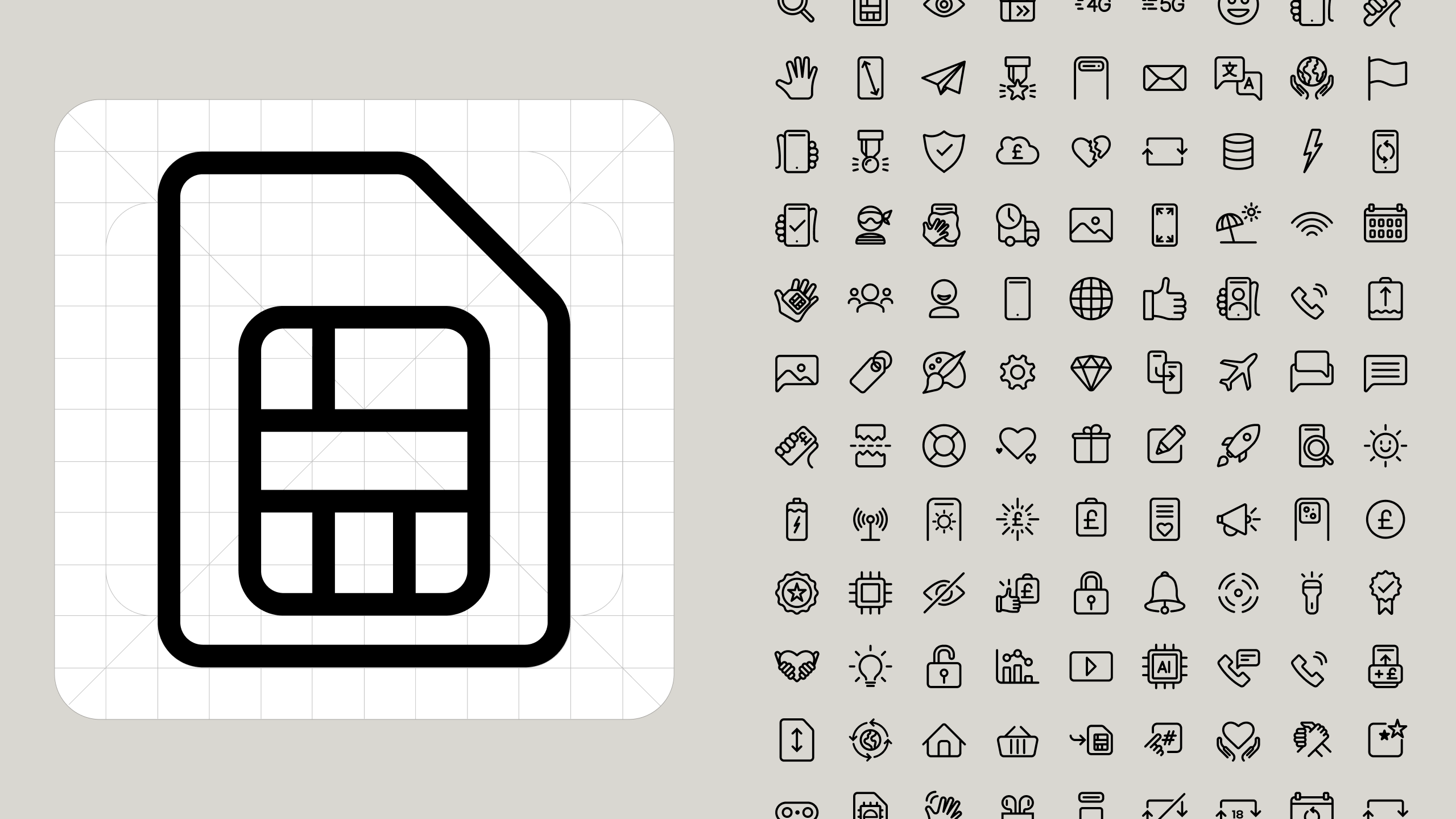
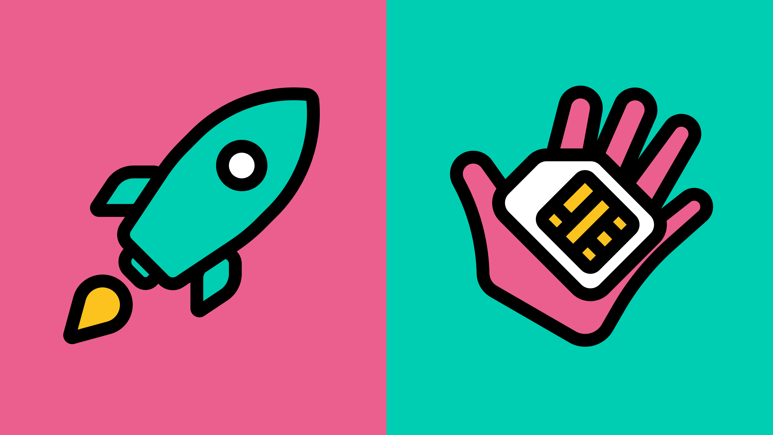
Brand guideline visuals
Let’s talk
If you’re building a product or team that needs this kind of thinking, I’d love to hear about it.