
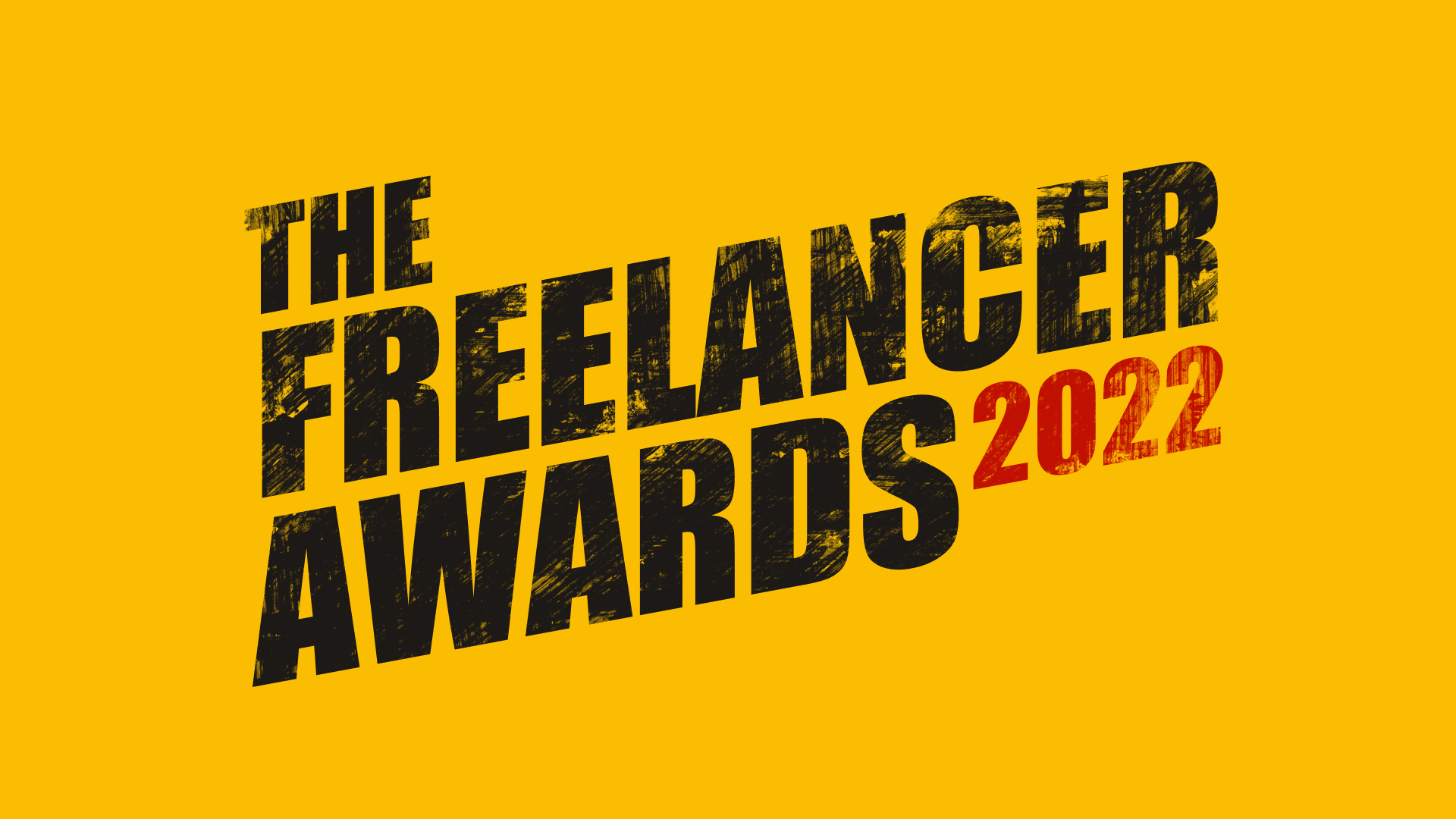
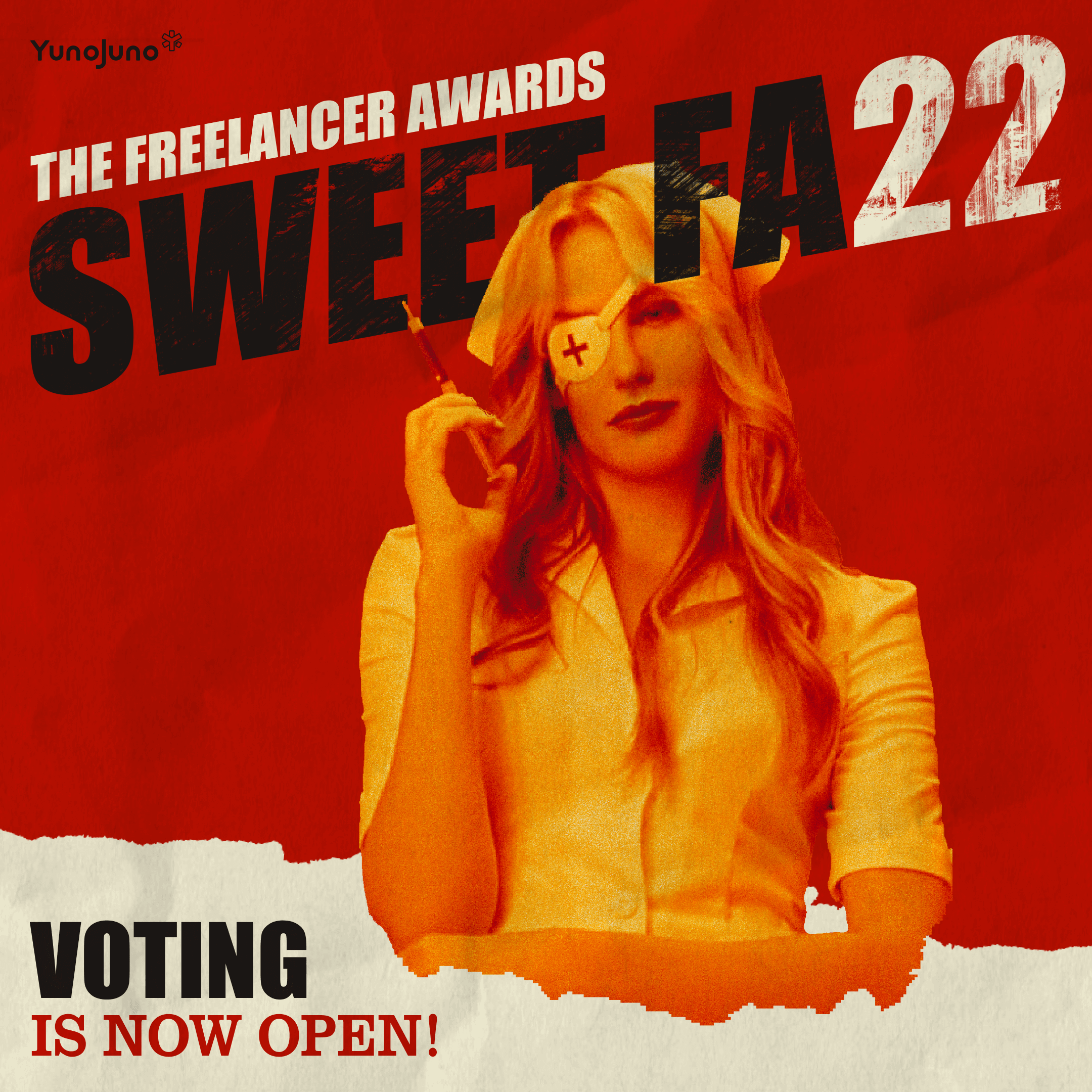
The Freelancer Awards 2022
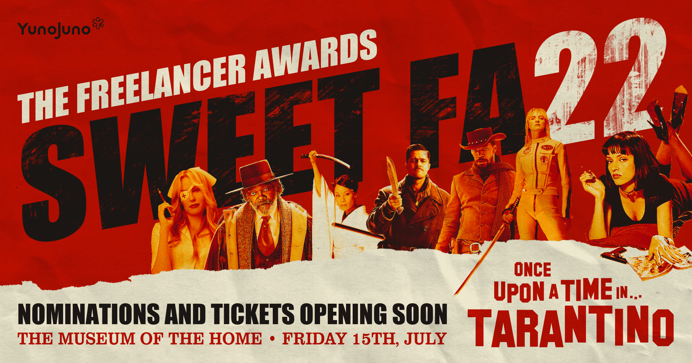
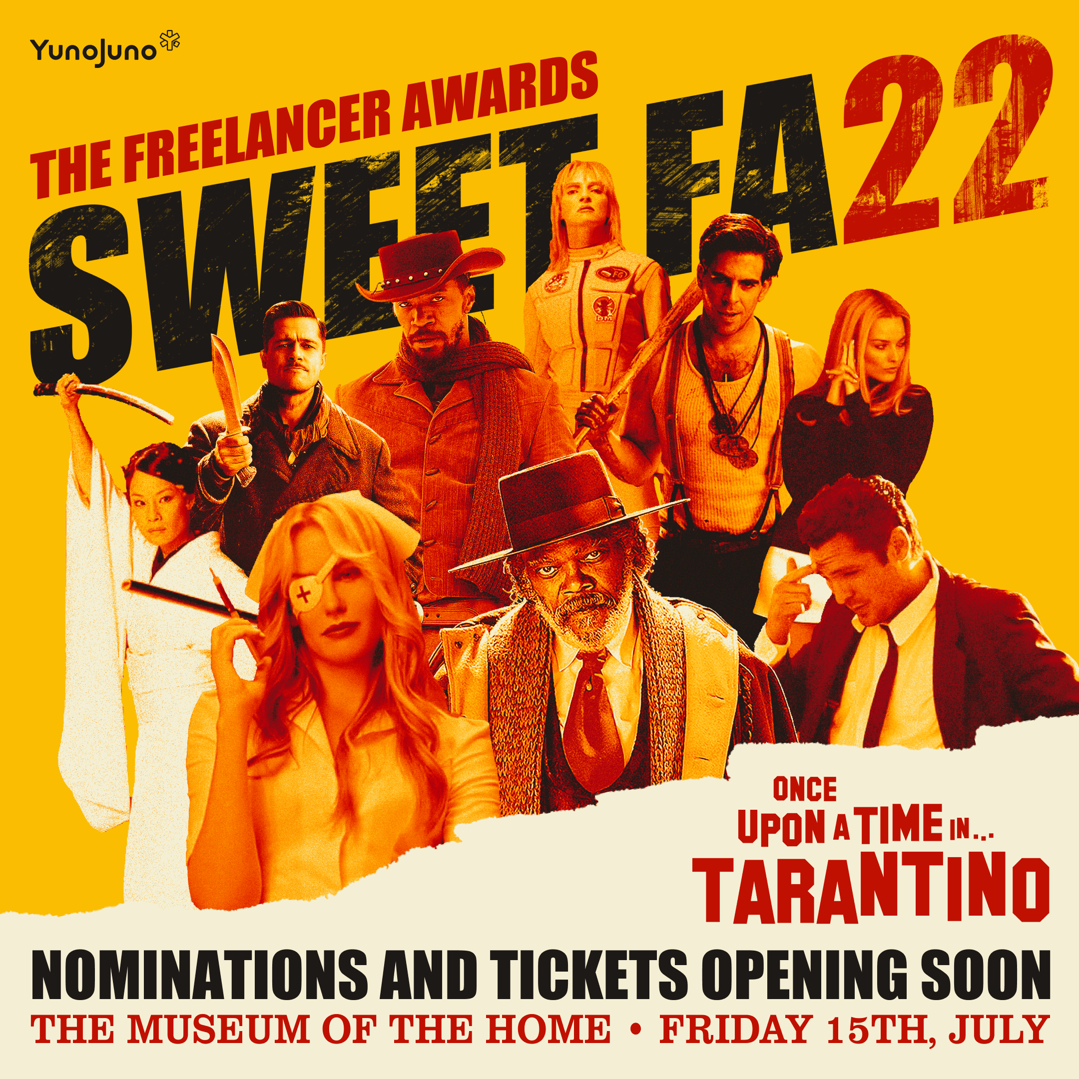
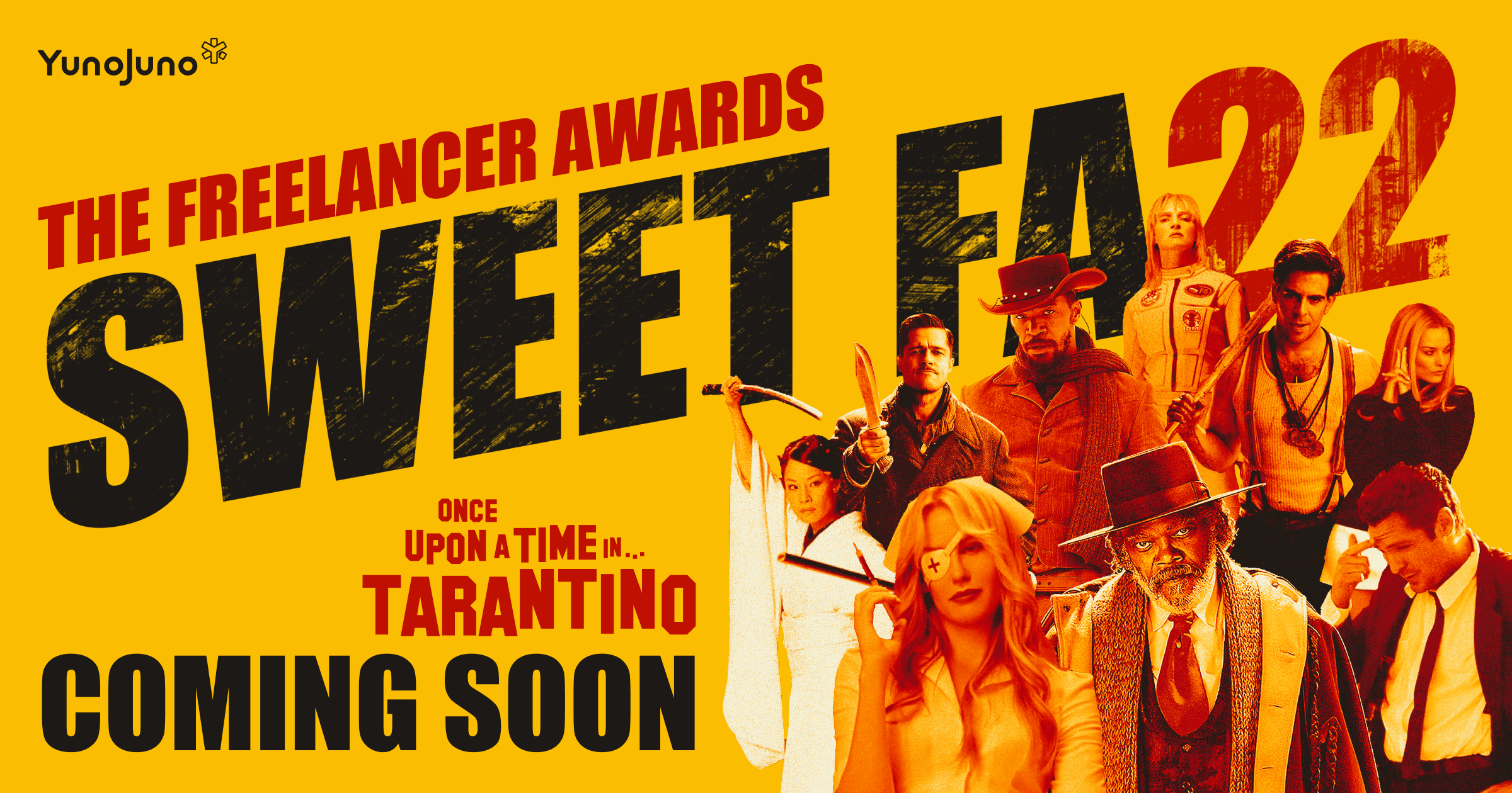
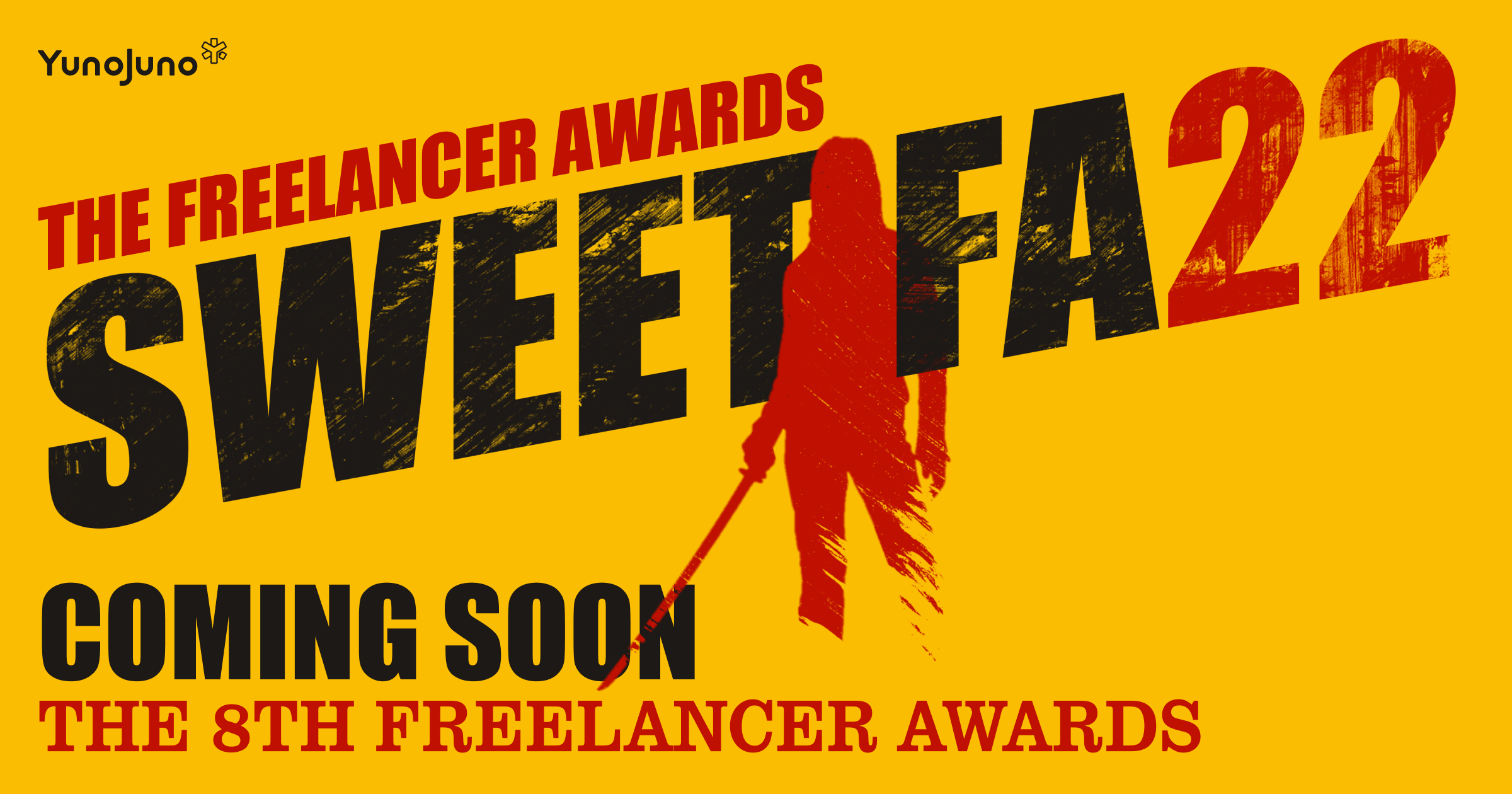
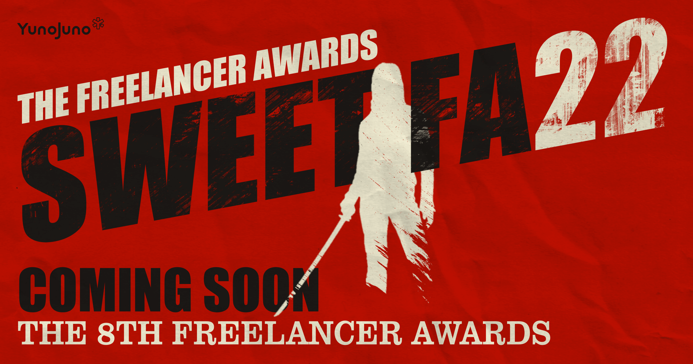
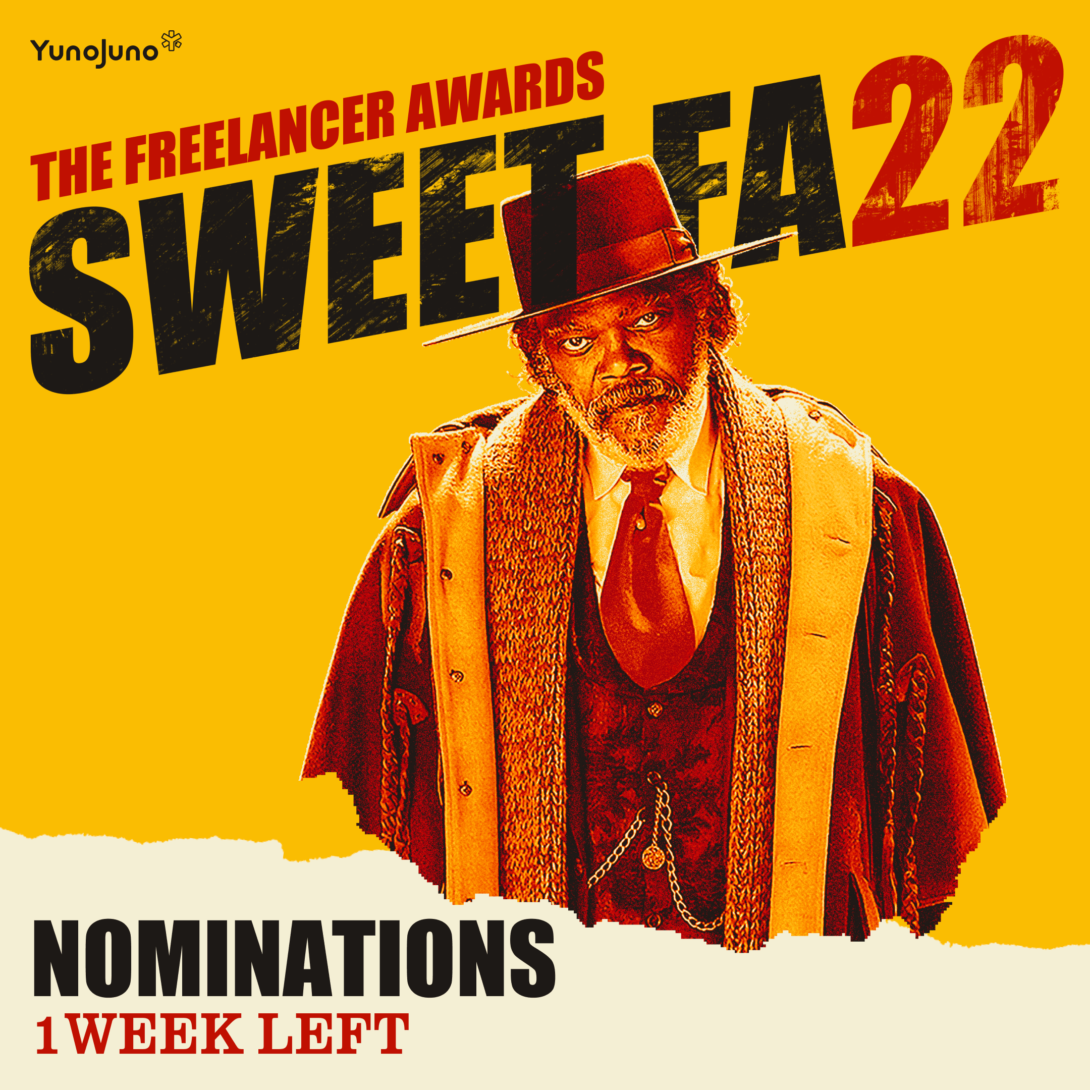
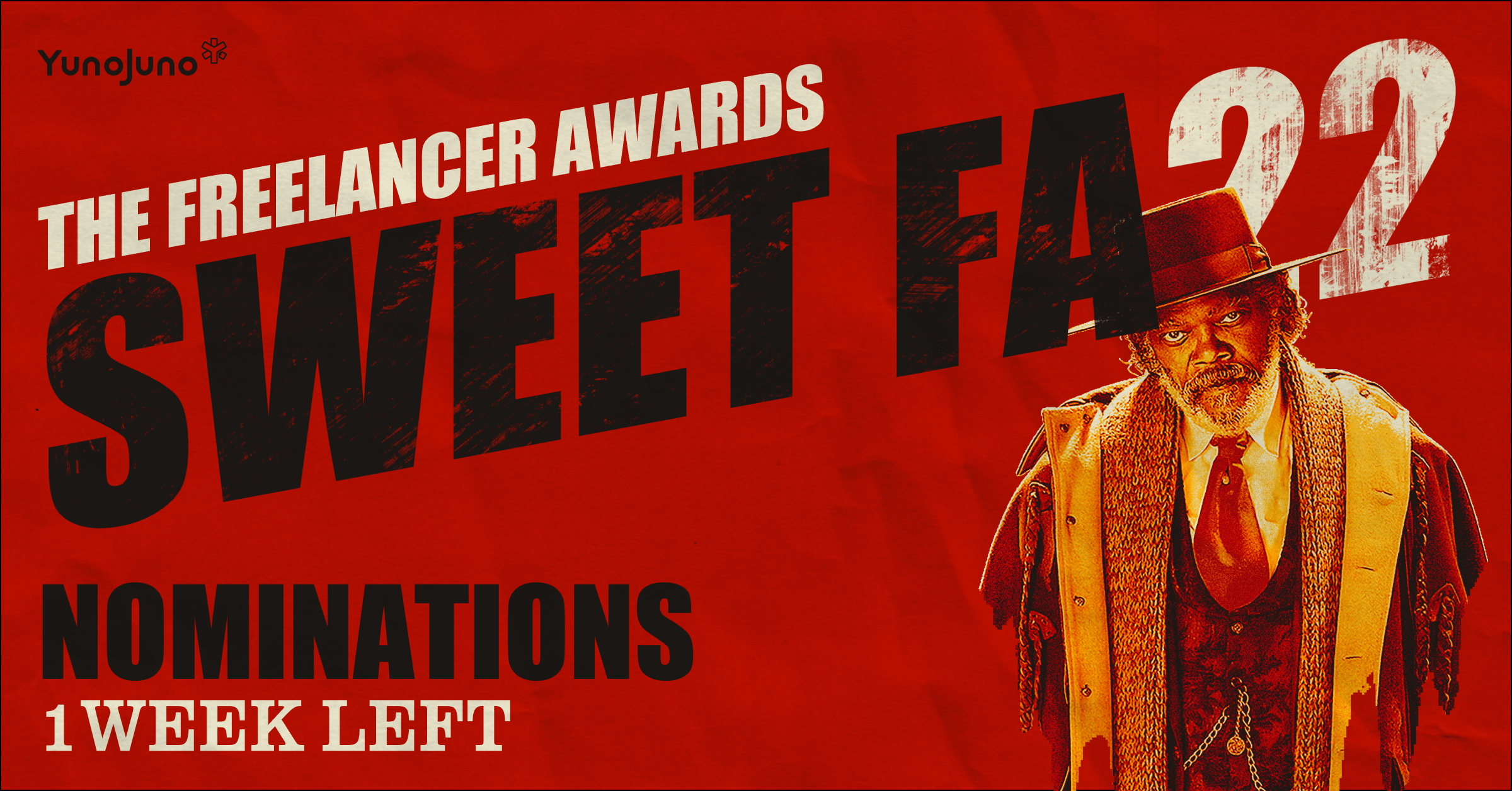
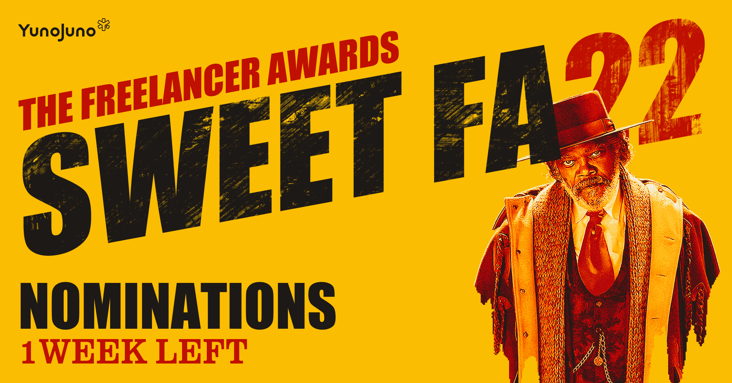
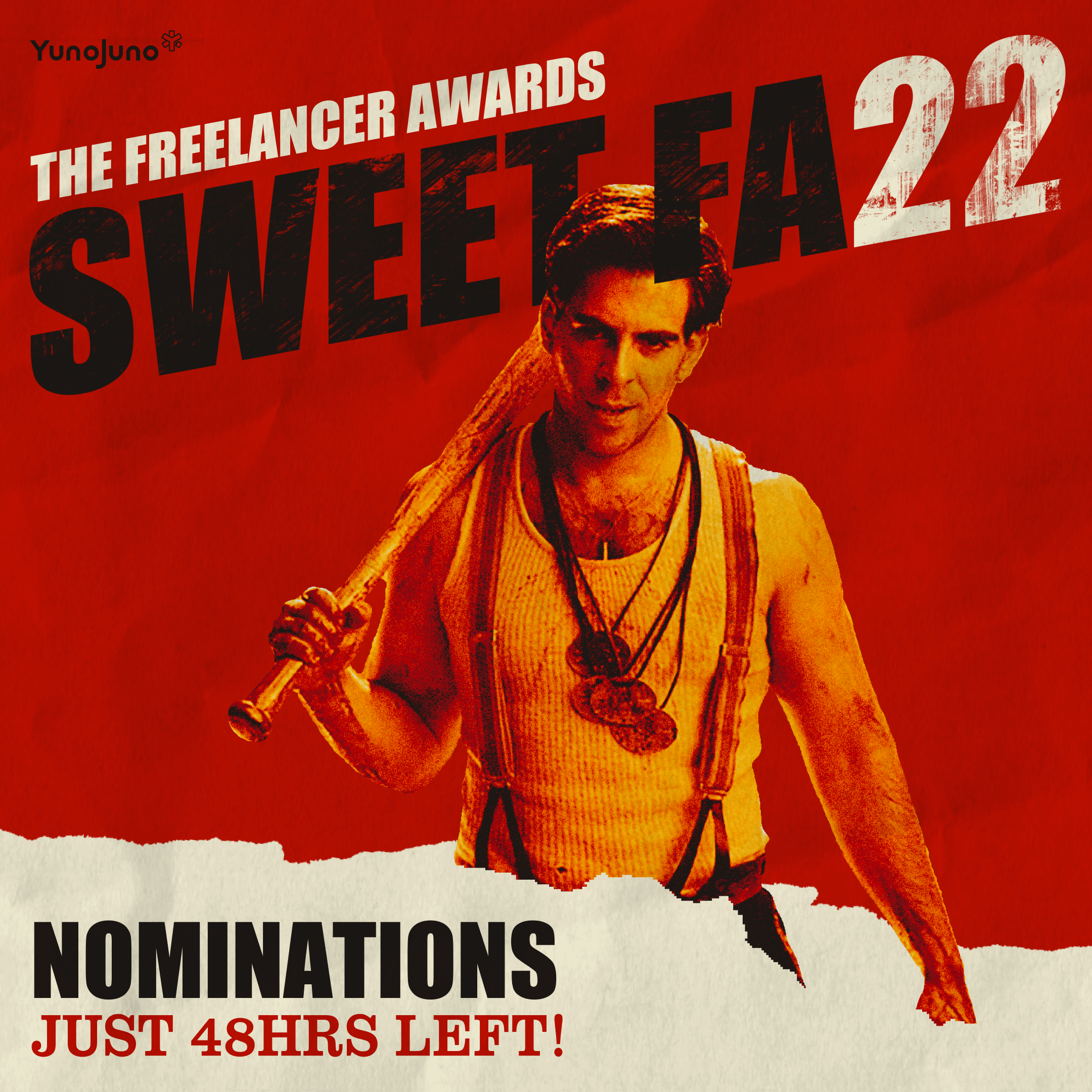
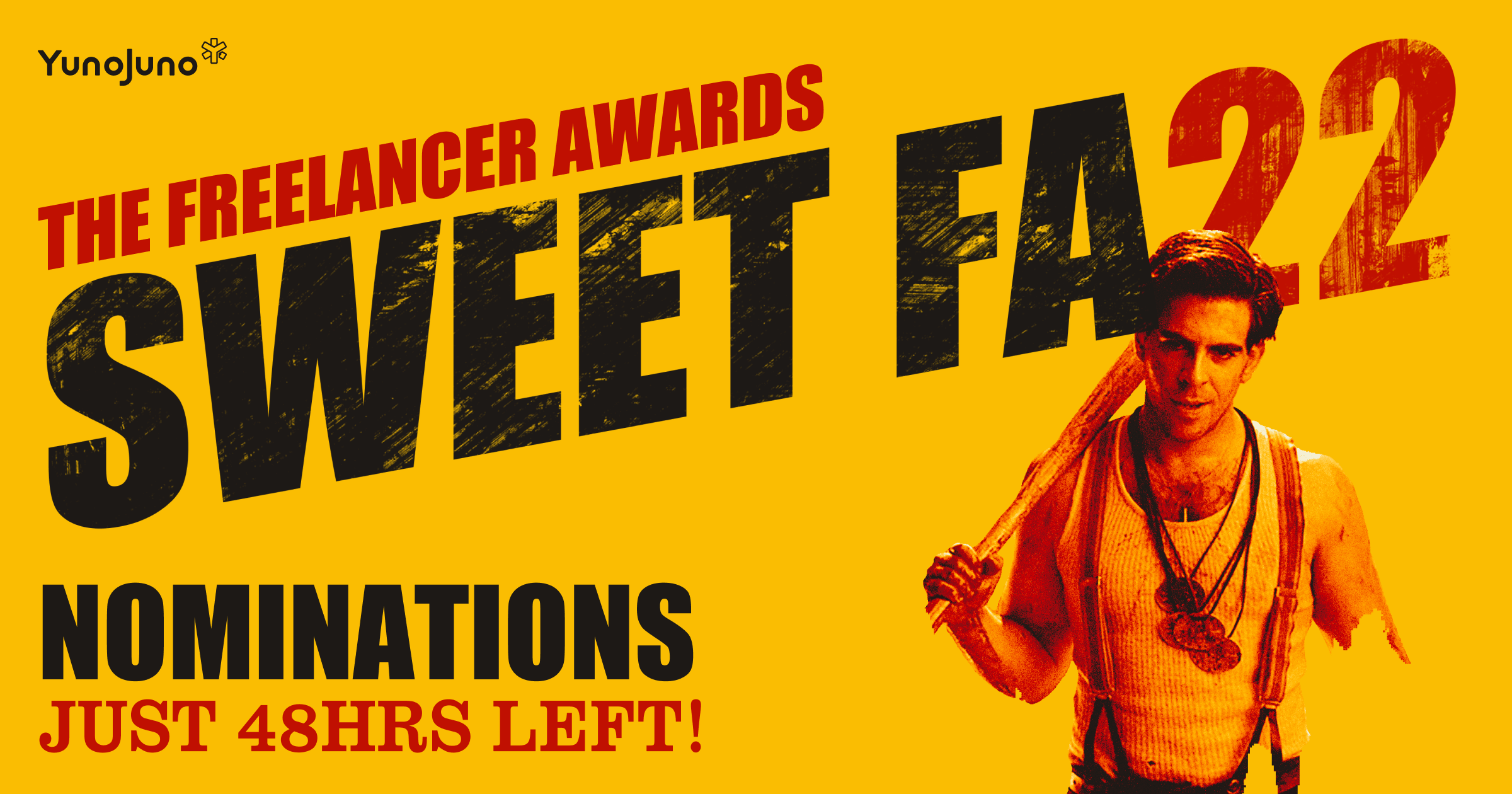
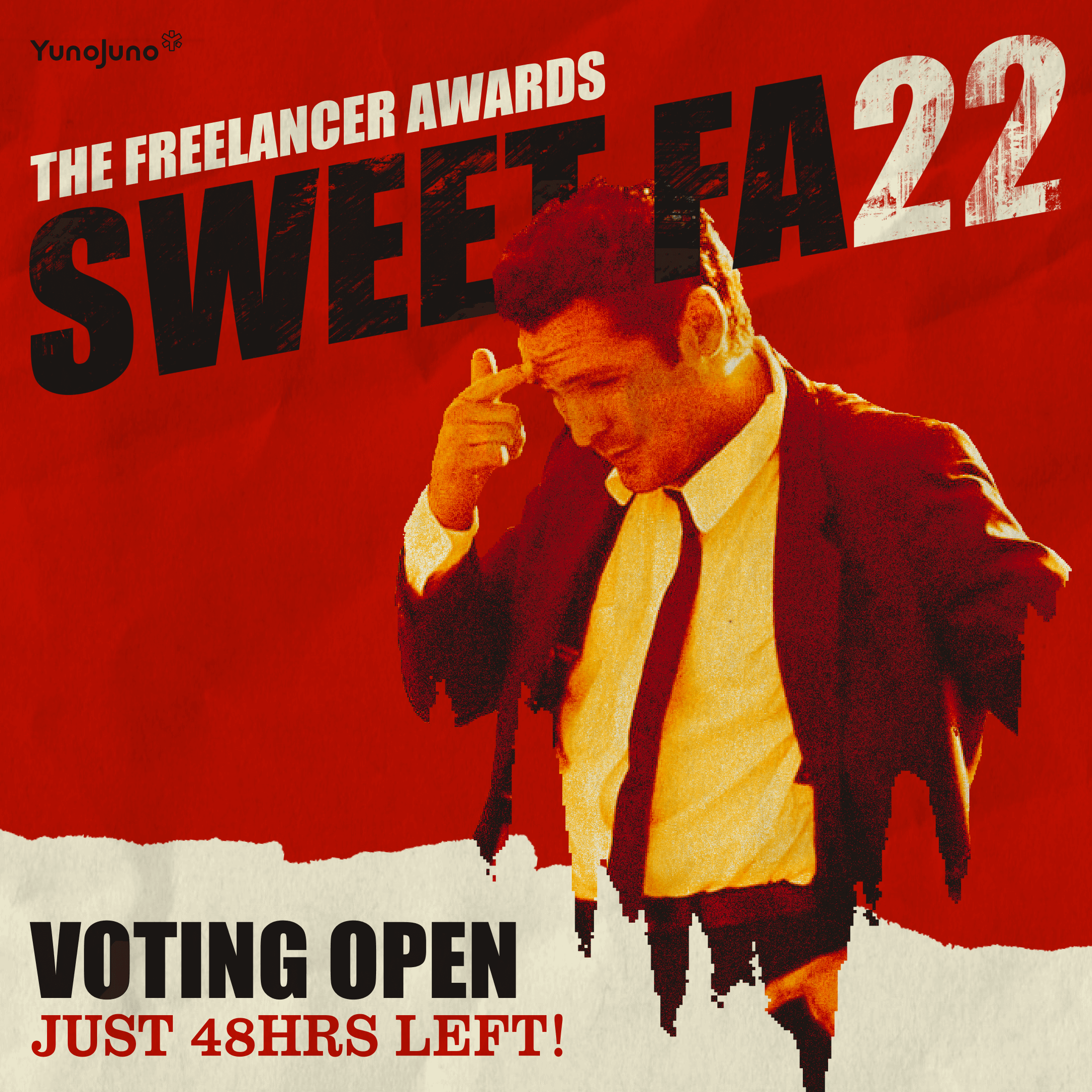
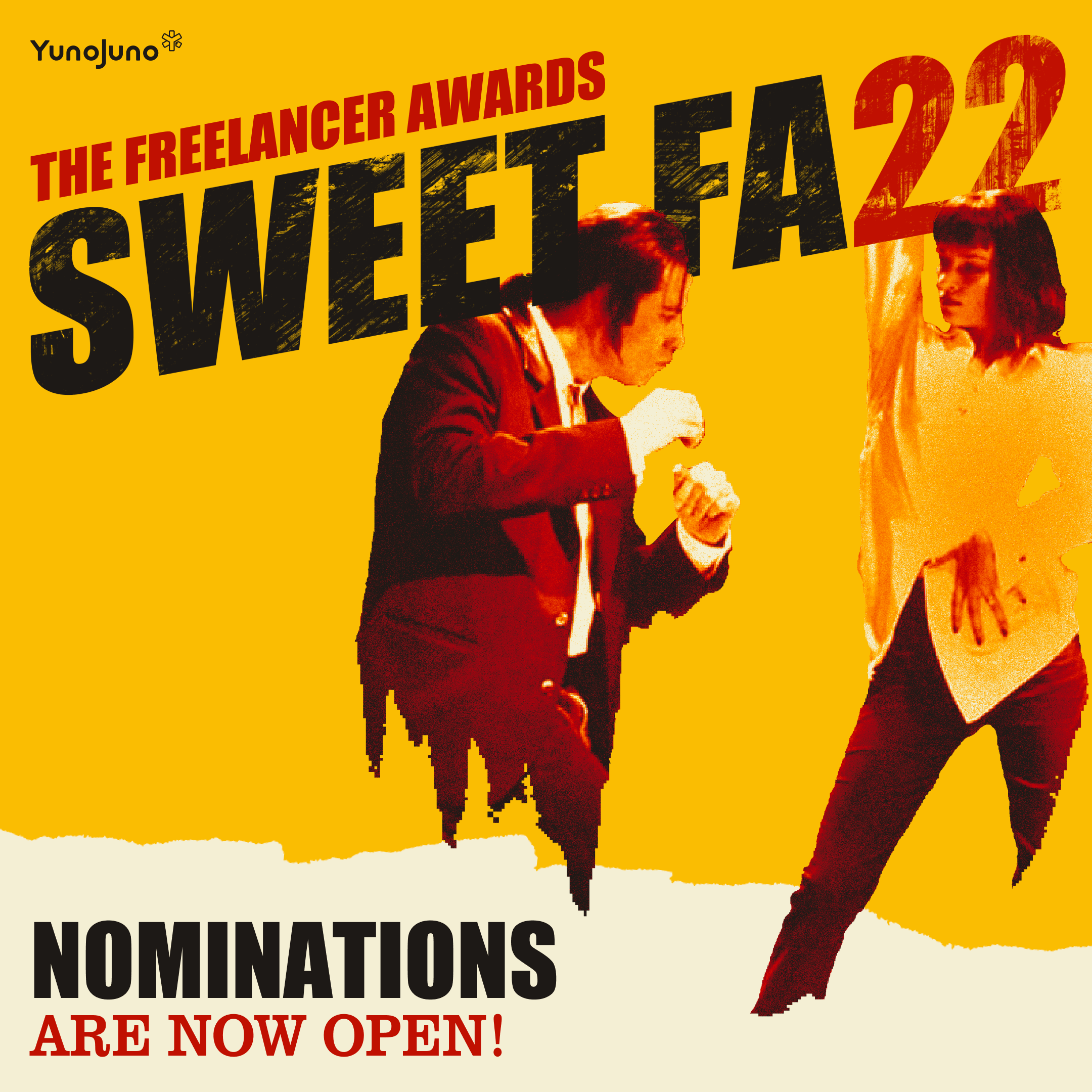
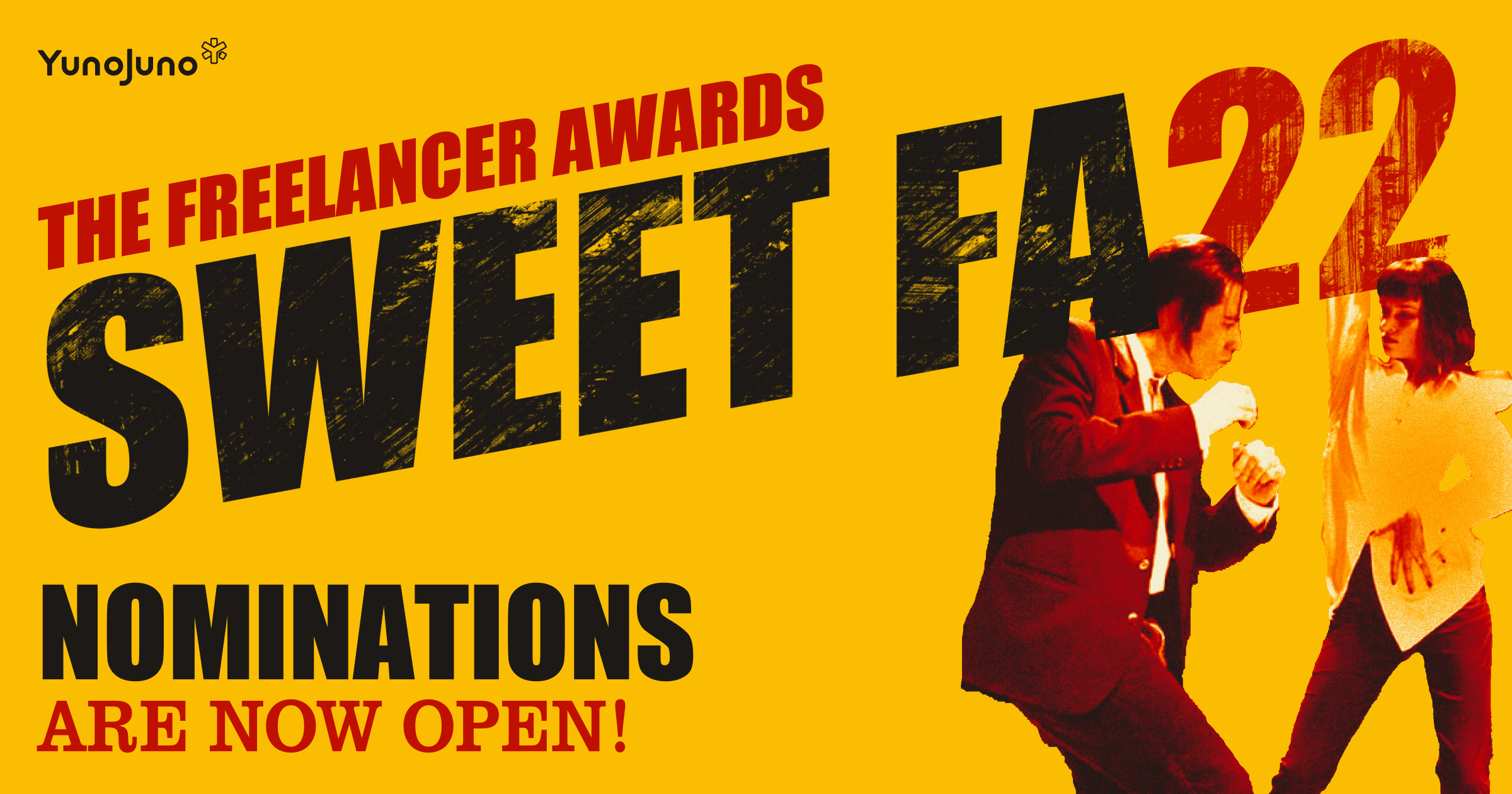
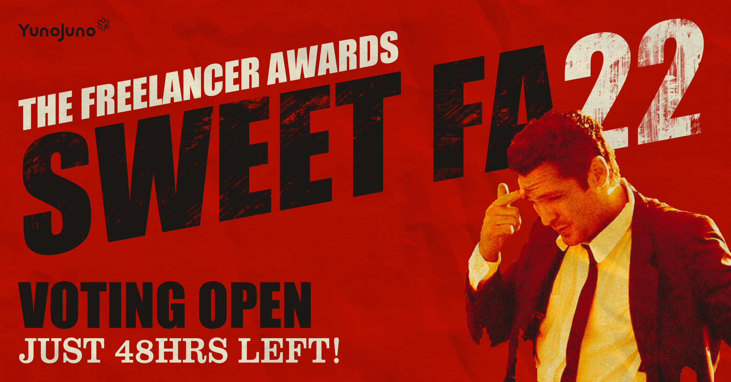
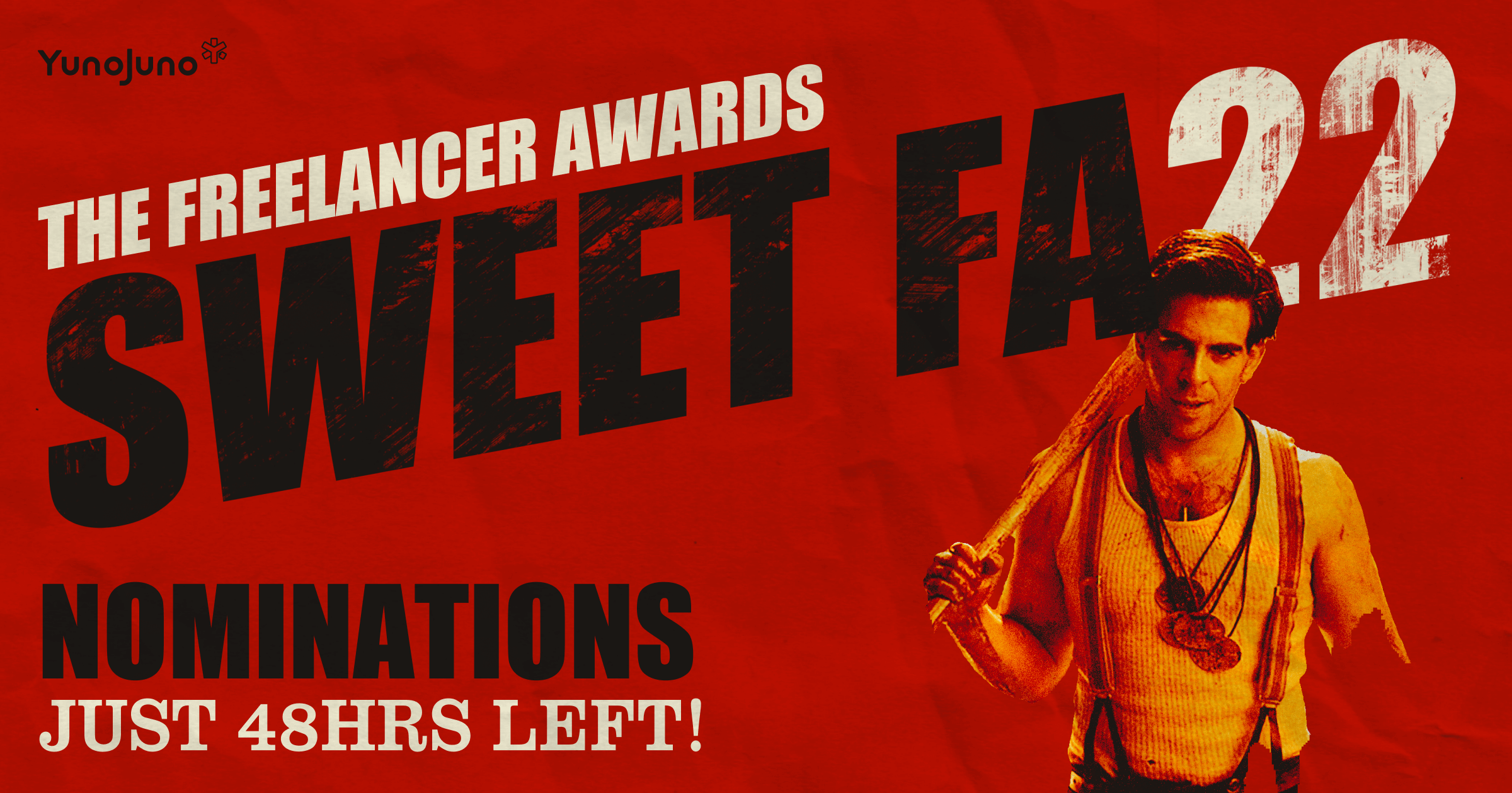
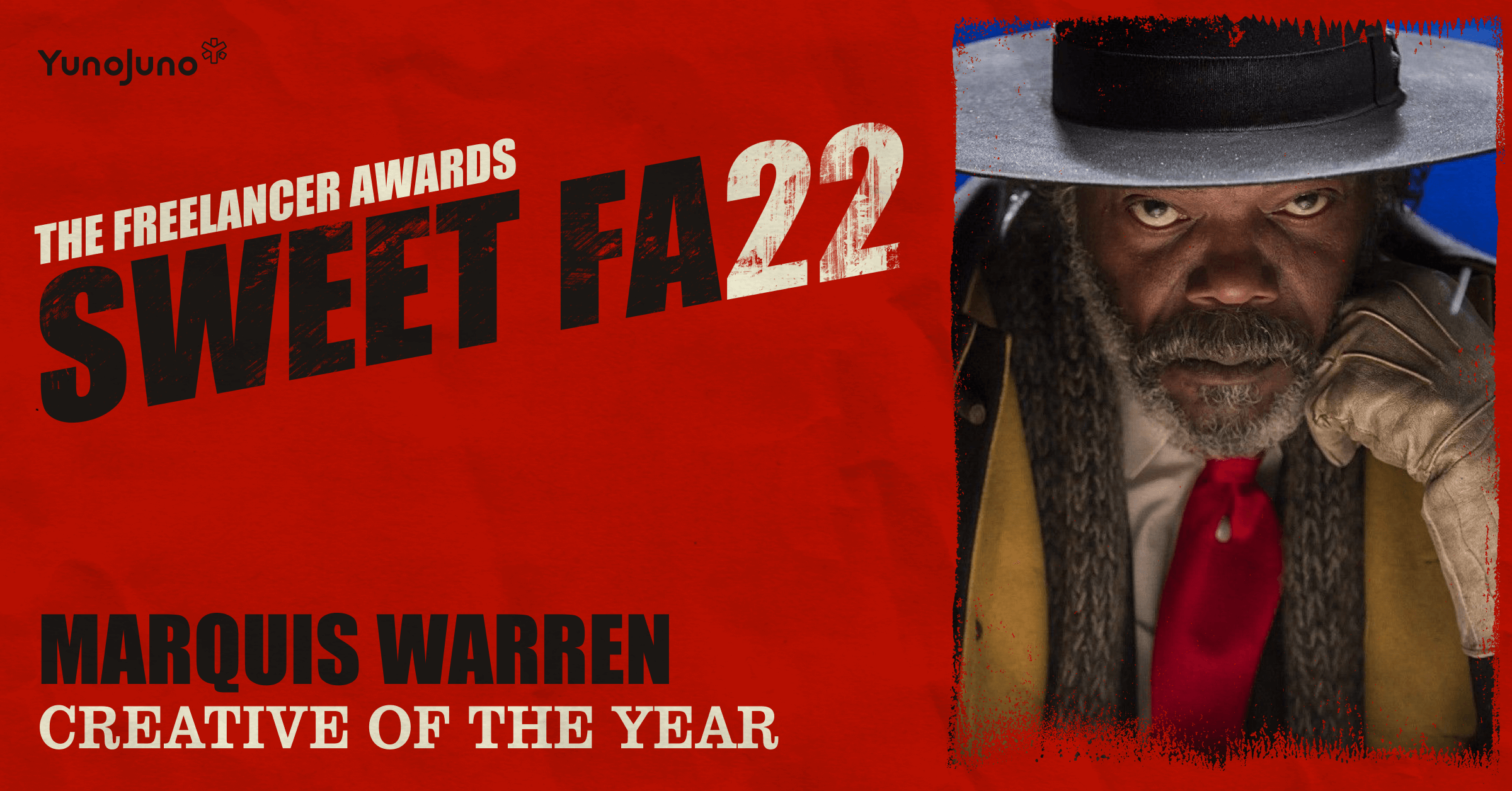
‘Make it feel like Tarantino.’ That was the brief. No brand guidelines, no asset library, no safety net, just a theme and complete creative freedom to reimagine the Freelancer Awards for its first in-person return since the pandemic.
Client
YunoJuno
Sector
Technology
Date
2022
Role
Creative Direction
Design & Art Direction
Branding & identity
The challenge
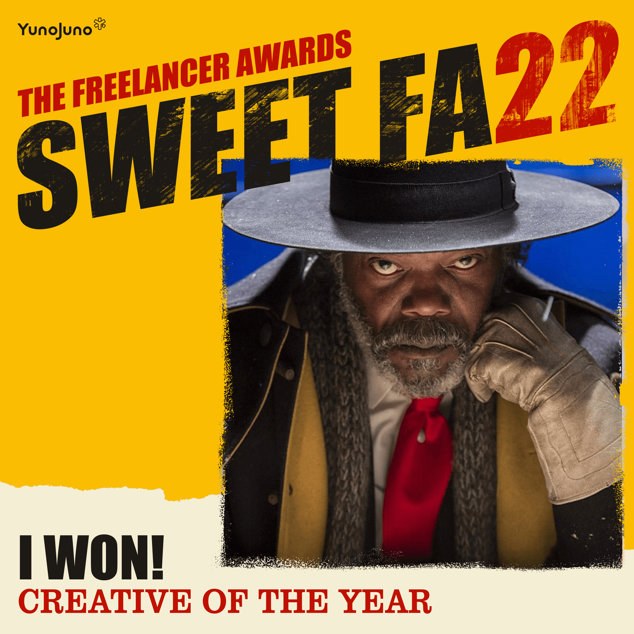
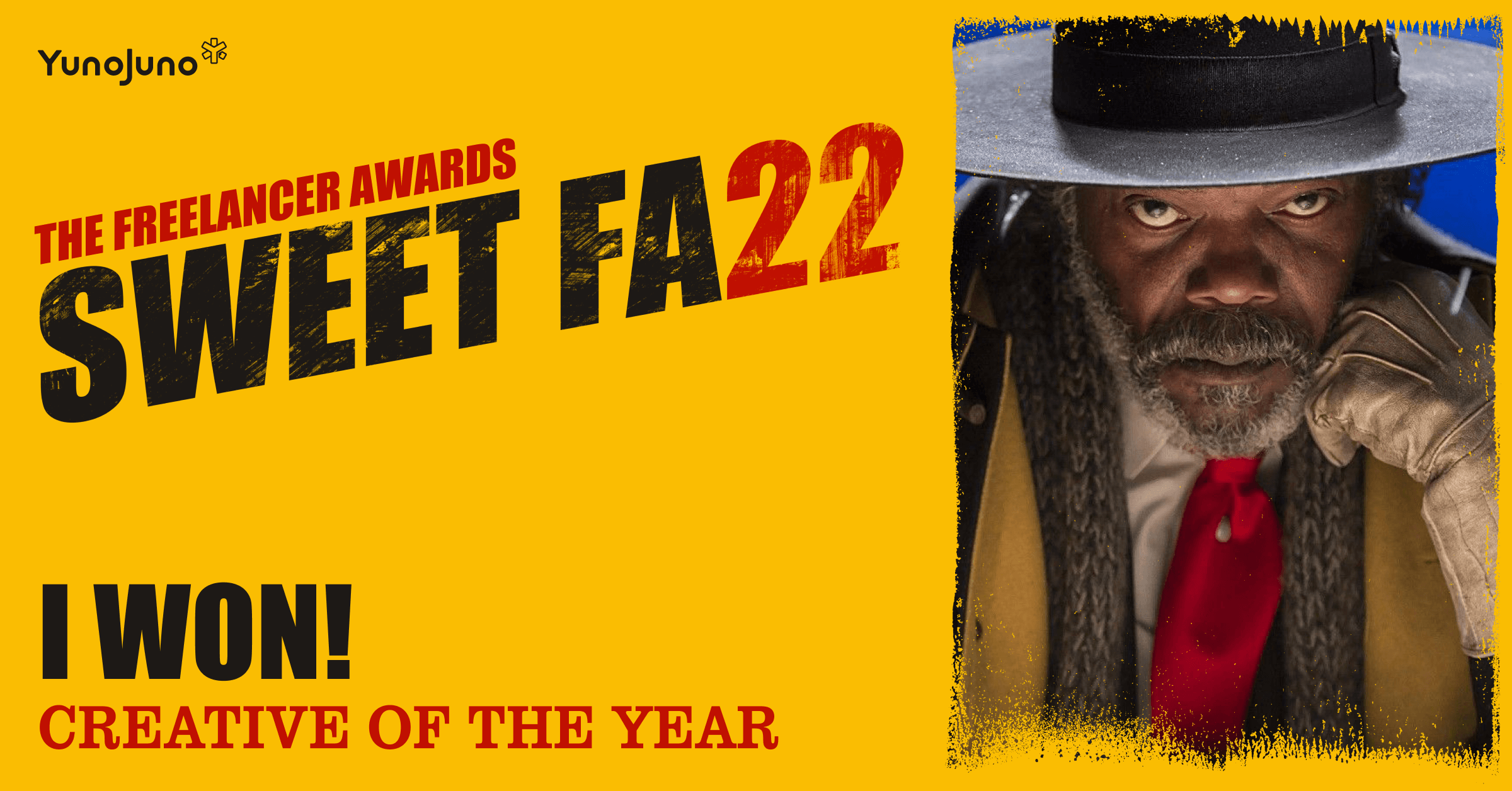
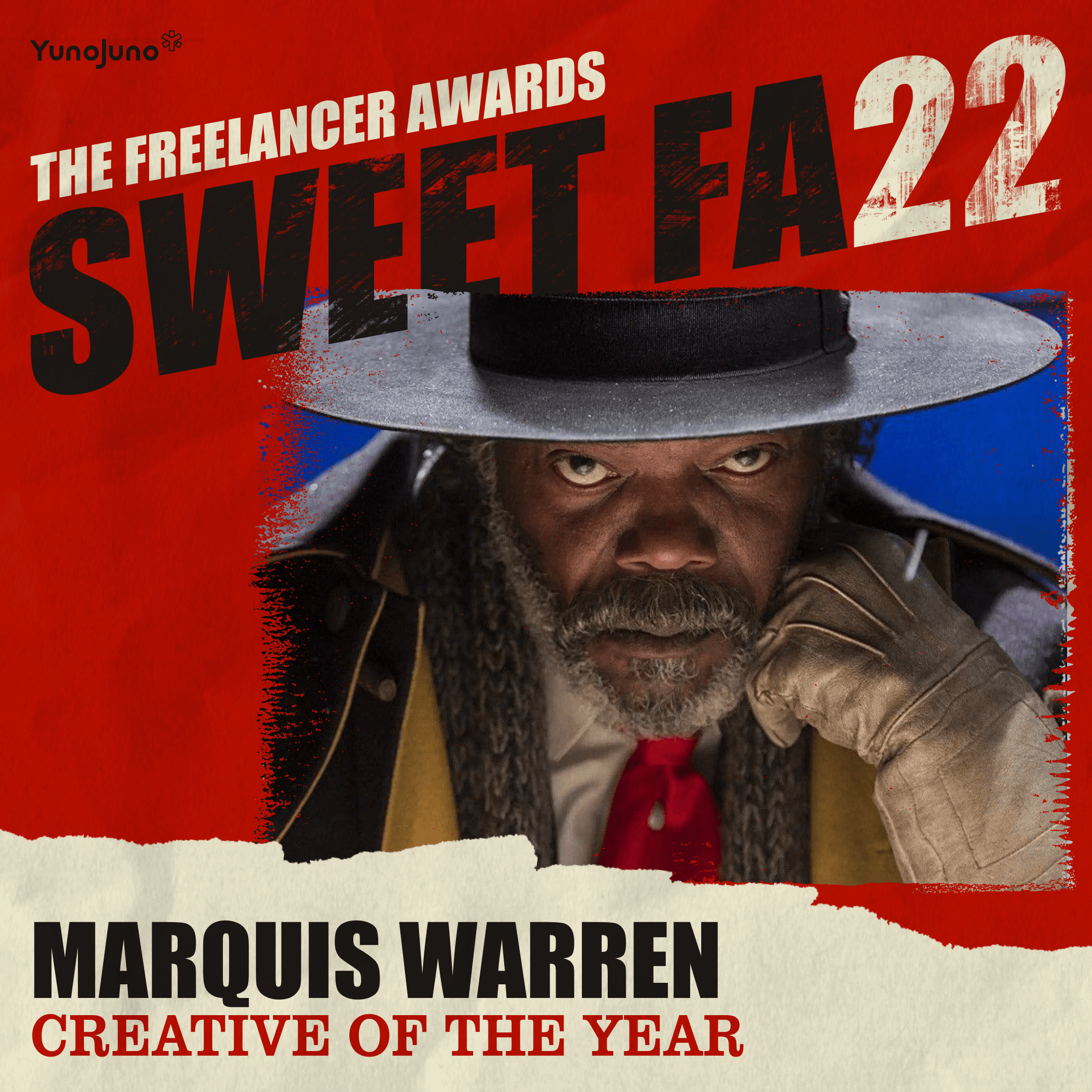
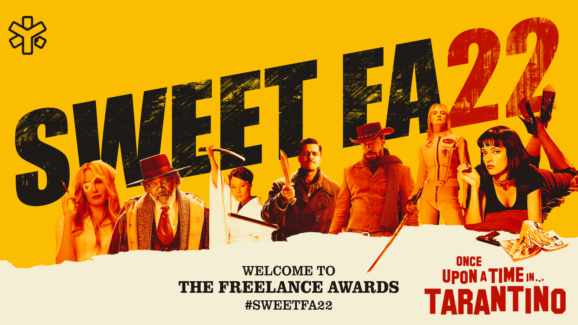
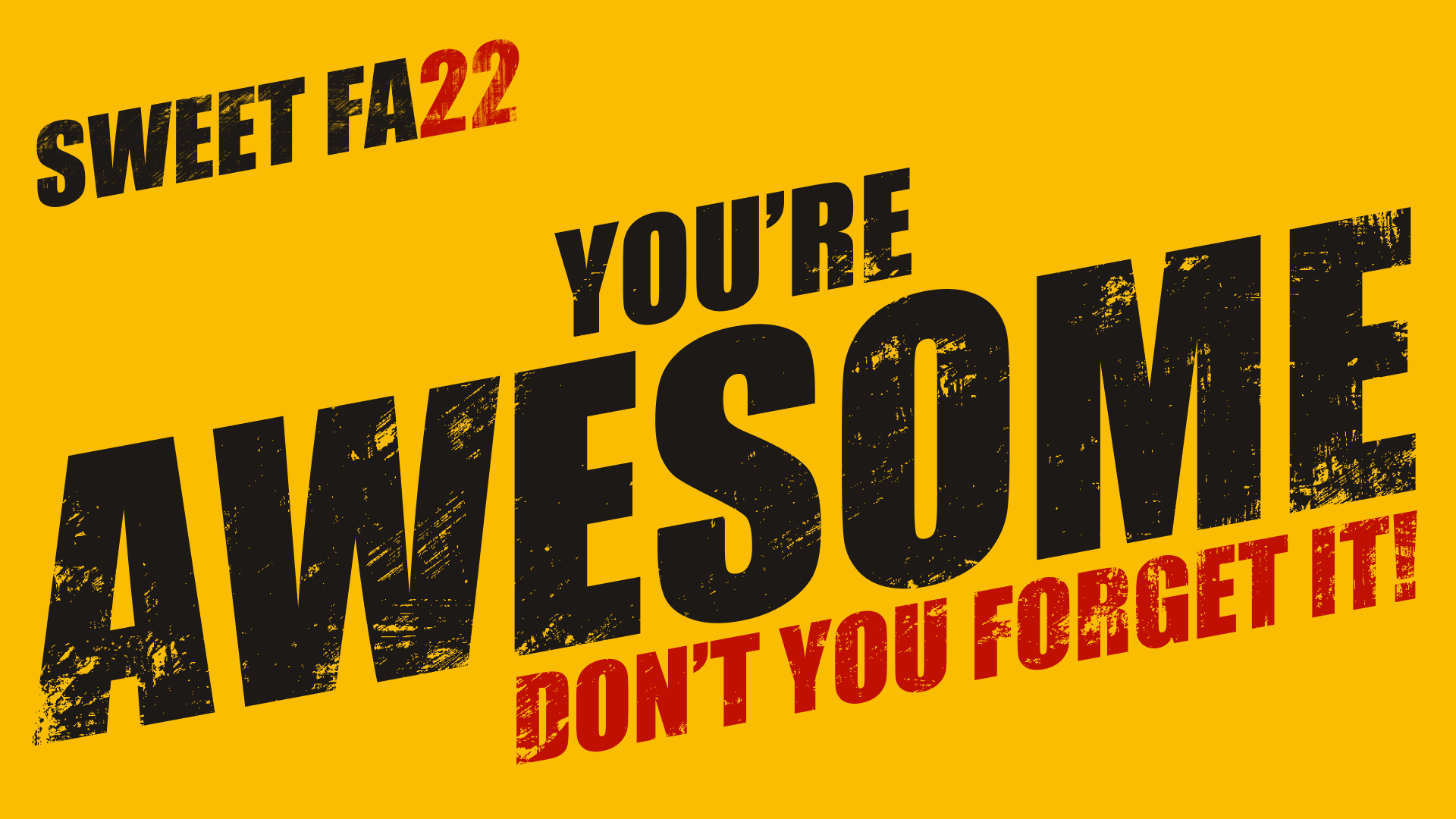
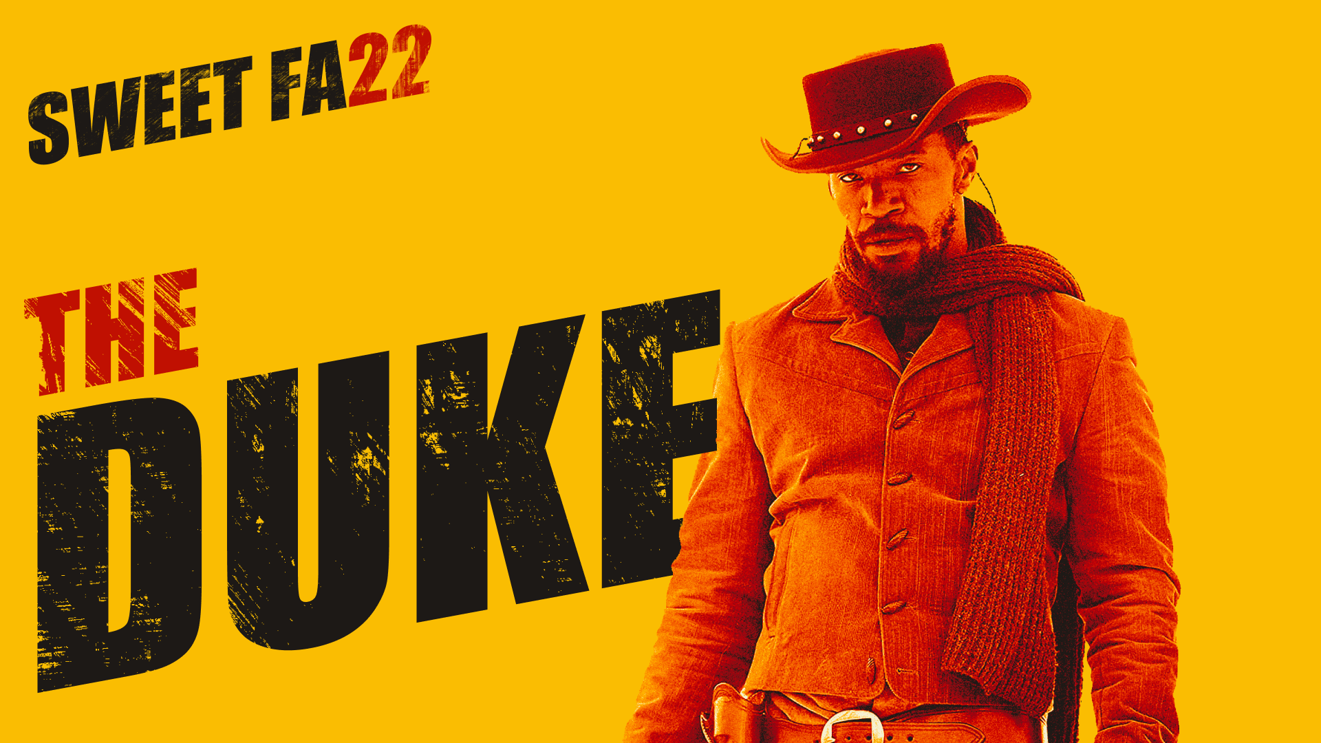
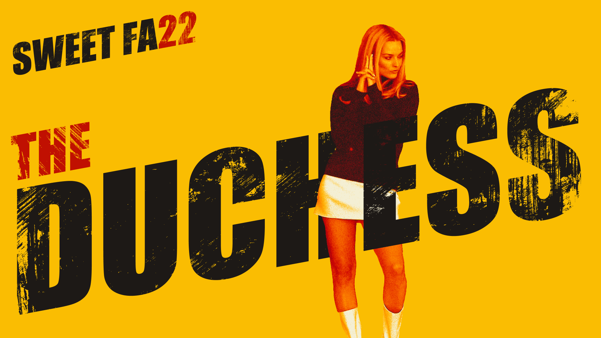
Tarantino's visual language is iconic precisely because it's chaotic. Hyper-saturated Kill Bill yellow clashing with Pulp Fiction's diner kitsch and Django's spaghetti western grit. The challenge wasn't just homage, it was total synthesis without pastiche.
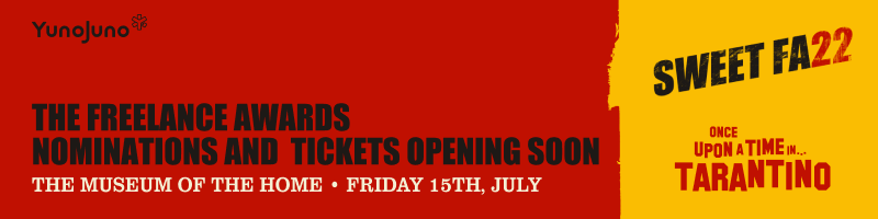
How do you create something that feels unmistakably Tarantino yet remains ownable by YunoJuno? And how do you make it work across invite emails, Instagram carousels, projection screens, and a live event without falling apart?

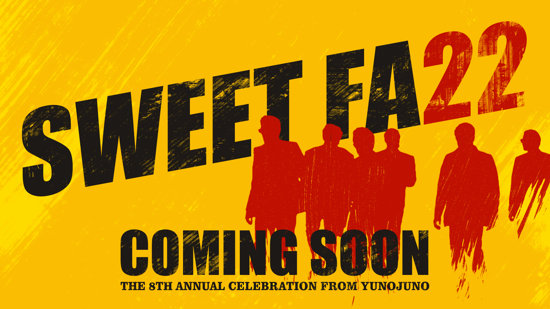
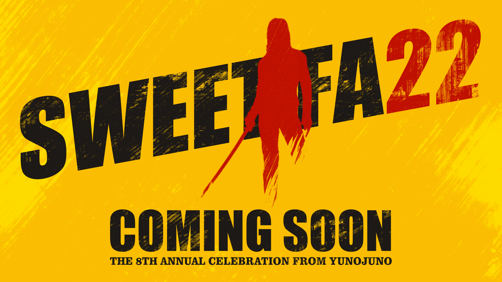
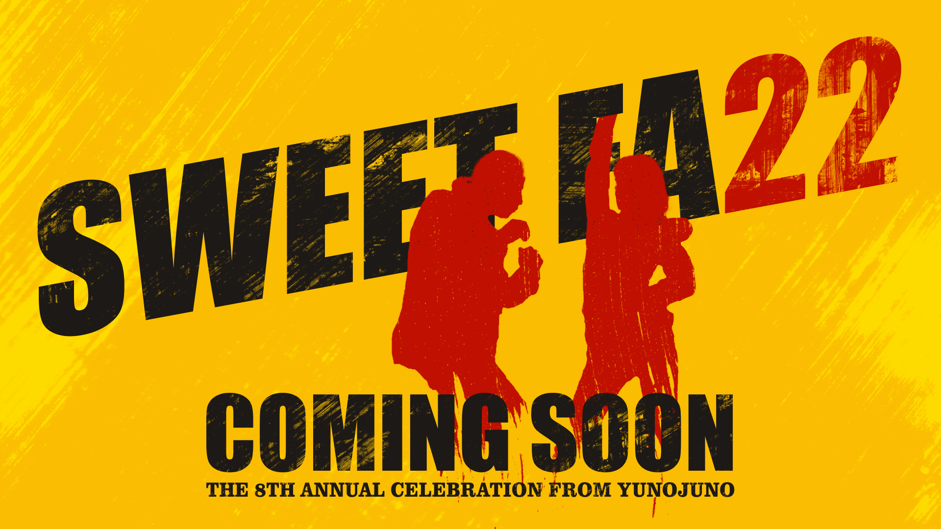
The approach
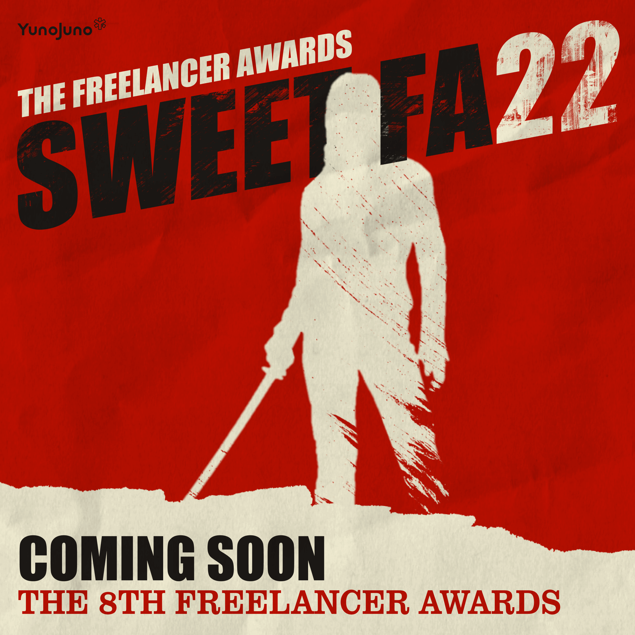
I established a design principle early: every element had to pass the 'recognizability test'—would someone scrolling Instagram instantly know this was Tarantino themed? This constraint became the system's creative engine.
The tritone gradient map wasn't just aesthetically cohesive, it solved a licensing problem. We could use any reference imagery and make it ownable through use that invokes ‘parody, caricature, and pastiche’
The impact
The identity didn't just land well, it became the event's story.
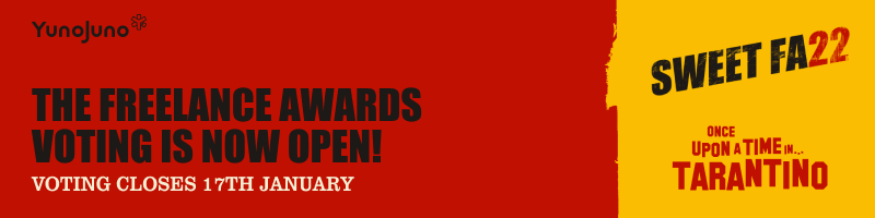
- 22,000+ votes cast (highest in the awards history)
- Record social engagement across all platforms
- Attendees immediately recognized the branding from digital comms to event collateral
- The bold visual system became a conversation piece, elevating the awards' cultural credibility
The reflection
This project taught me that constraints aren't always in the brief, sometimes you have to create them yourself. By establishing clear design principles early - recognizability, modularity, and tonal consistency - I turned an intimidatingly open brief into a scalable creative system.
It reinforced a core belief: the best design systems aren't about control, they're about creating the right conditions for creativity to scale.
This remains one of my favorite projects, not just for what we made, but for what it taught me about leading creative work from instinct to infrastructure.