
A fresh advertising campaign for Quickbooks prompted the need to refresh their website with campaign imagery. This was seen as an opportunity to lift the entire user experience with a motion language that could be used going forward.
After helping to design the website in Figma, I took the static layouts in After Effects to create three separate concepts. One style of animation was crafted for each of the visual concepts to help the client visualise how the final website may look when built.
When designing motion for a website, it’s essential to isolate the components down to their basic level. This helps developers to understand the intricate steps needed when building.
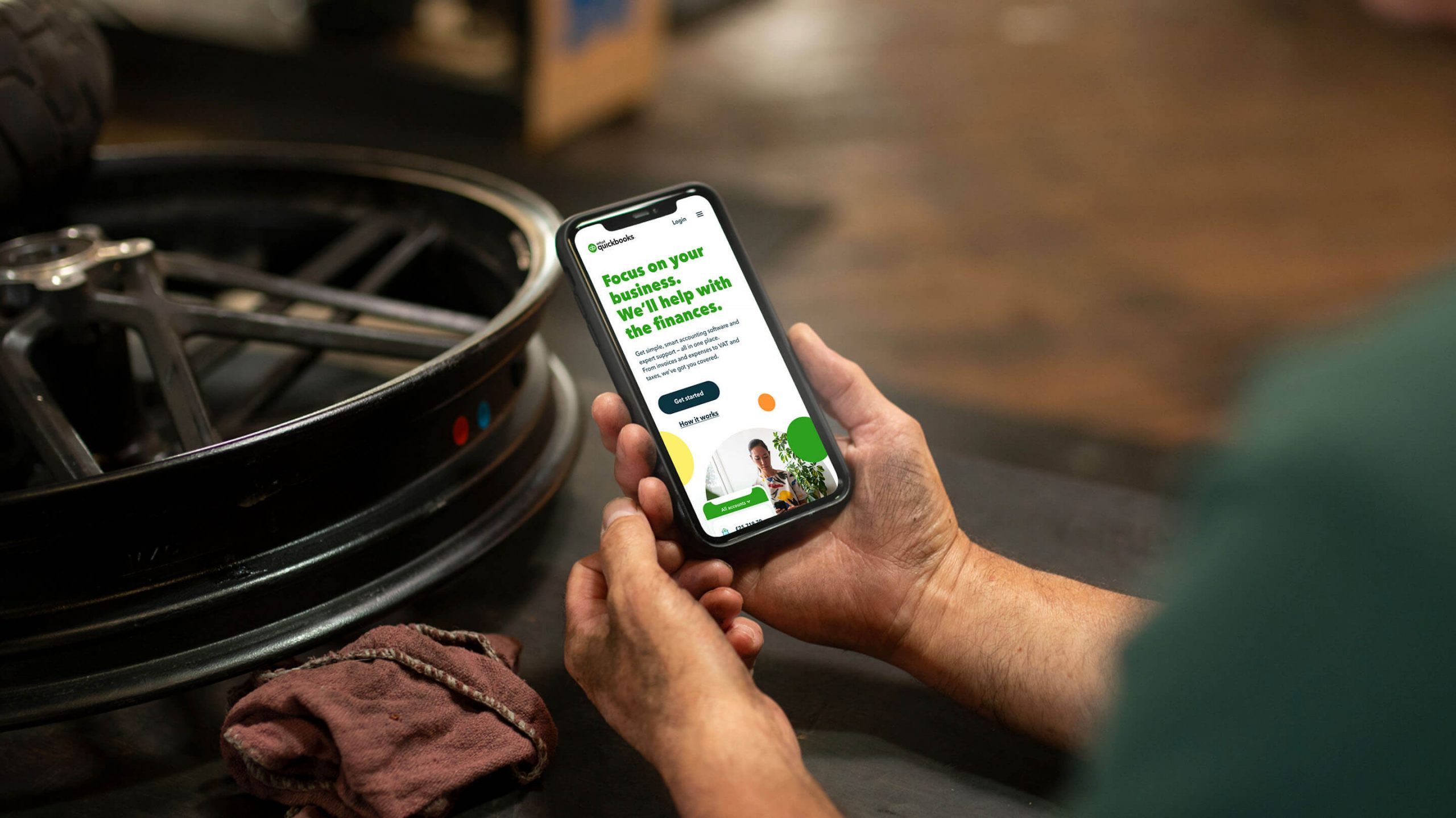
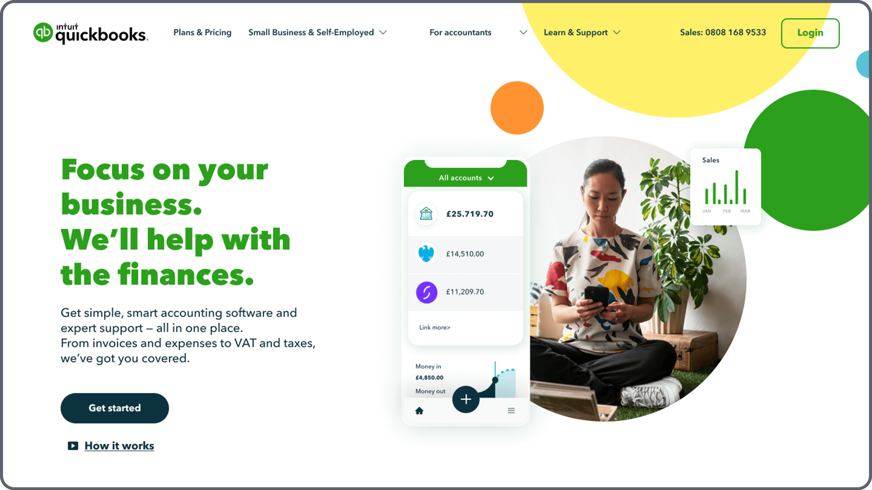
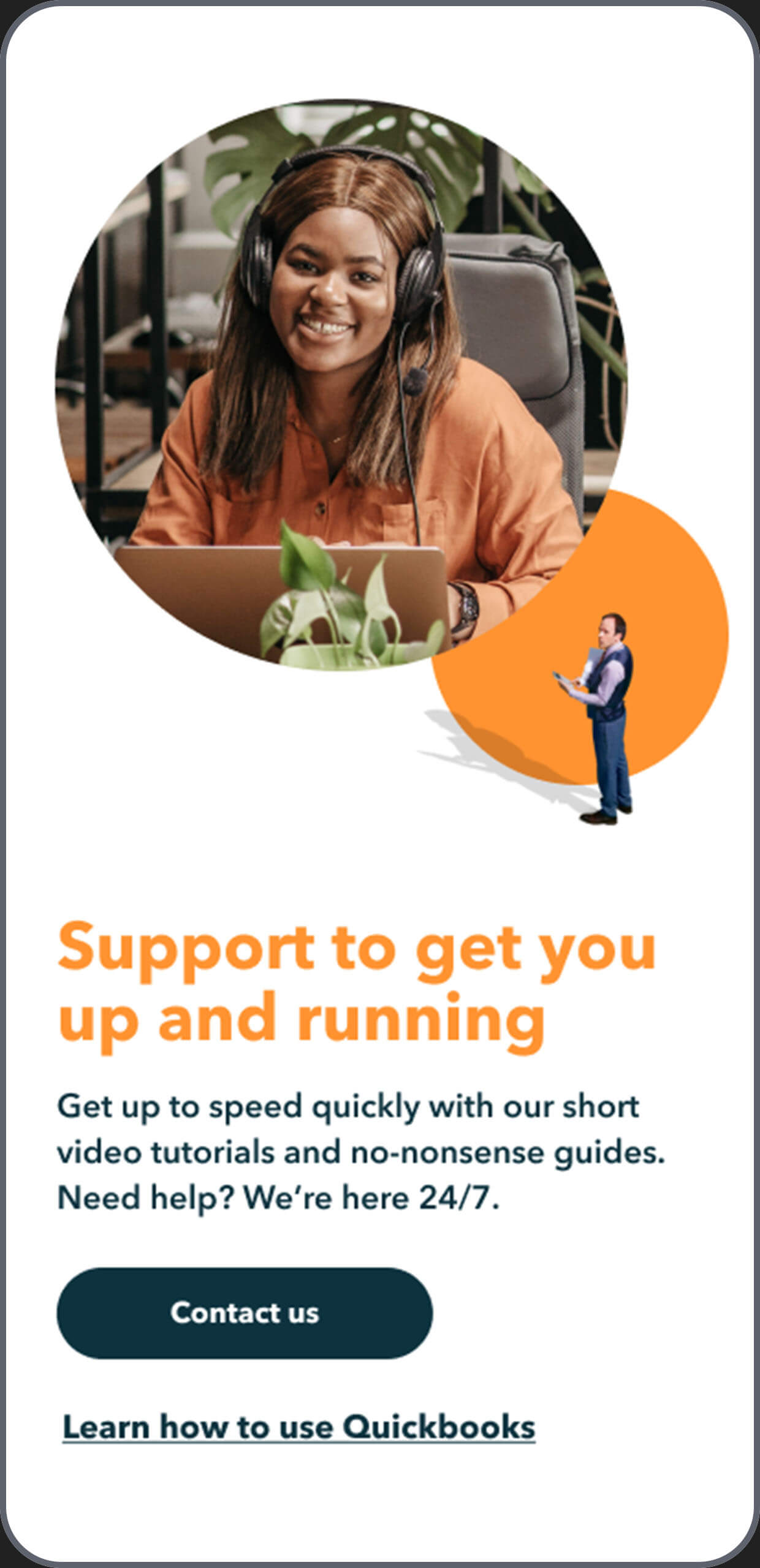
One of the main challenges of the visual interface design was finding a solution for including the mini-people from Quickbooks advertising campaign that works at a brand level but also supports the user experience.
We achieved this by shrinking them down to secondary-level imagery and leading with bold portrait photography.


At the start of the project, I mocked up a motion concept that animated basically everything on load.
This was tested to be too overwhelming for their target users so we reduced the level of motion moving forward.
Agency — Wieden and Kennedy
Client — Quickbooks
Head of Delivery — Dom Felton
Visual Design — Bashi & Alex Melville
Motion — Alex Melville
Art Direction — Alex Melville
Design — Alex Melville
Agency — YunoJuno